4 “Branding Rules” to Break if You Want Your Product to Sell
Take a walk through a local dispensary.
Or scan the shelves at your local liquor store.
You’ll notice a stark dividing line running right through the products shelves.
On one side of the line are the brands playing a defensive game. They are stuck inside the industry clichés. They lean into soft, hyper-minimalist pastel cans or clinical, sterile pouches because they’ve been told that’s what it takes to look professional. They try so hard to follow the standard corporate playbook that they effectively blend into the background or the products next to them.
But on the other side of that line? Epic brands.
The ones standing out, taking up space, and making people stop in their tracks.
These are the brands that refuse to play small. They build genuine, raw personalities. They take a stand, inject a culture into their visuals, and create an unshakeable connection with the people who love them.
As a CPG founder, you have a choice to make about which side of that line you want to live on.
If you are ready to stop playing it safe and start forcing the market to take notice, it's time to shed the corporate drag.
Here are the four traditional branding rules you need to break immediately to claim your space.
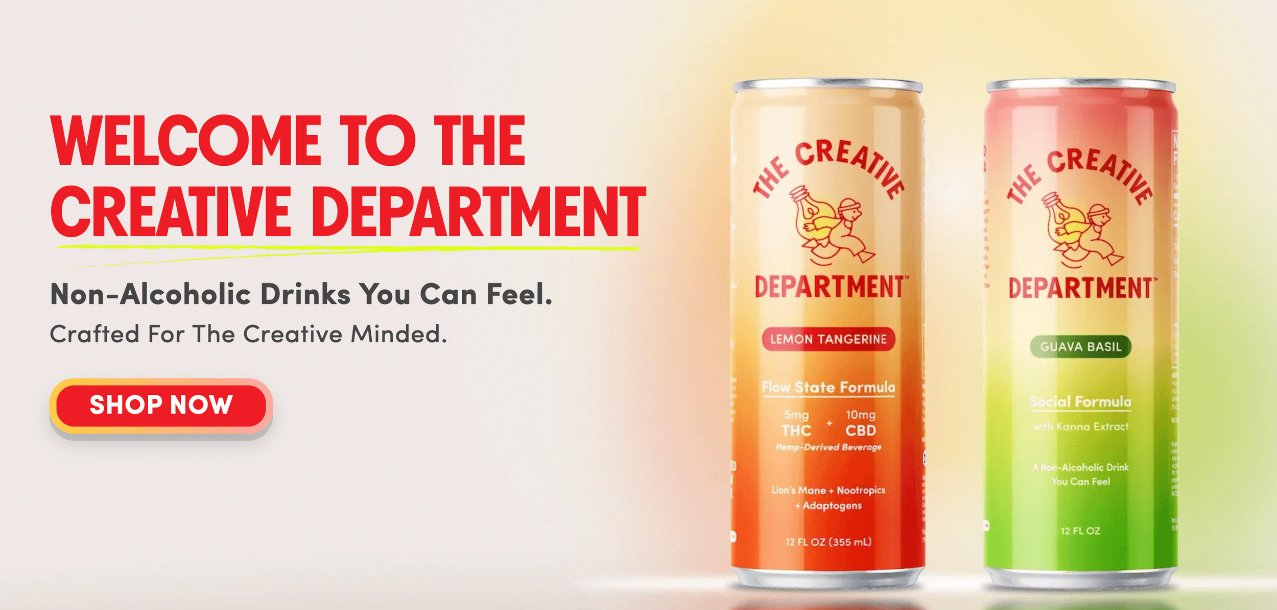
By launching an alternative N/A beverage line that targets actual creative subcultures instead of the safe, beige masses, The Creative Department gave their brand the teeth to build a powerfully loyal fanbase.
Rule #1: "Your brand must look safe and appeal to everyone."
The brands blending into the background are usually terrified that a bold, opinionated visual identity will alienate half the market.
Out of fear, they water down their concepts. They smooth over the rough edges.
They try to appeal to everyone, not daring to share any polarizing opinions.
But safe is a symptom of a brand that has stopped taking risks. On a crowded shelf, neutrality is a death sentence.
Epic brands understand that you don't build a cult following by being universally tolerated. You build it by being a magnet.
Your packaging needs to act as a filtering mechanism. It should call out directly to your specific target culture and happily repel the people who aren't your vibe.
Don't delete your personality to appease the masses. Give your brand some teeth.

MiD absolutely crushing the game. They started right here in Denton, Texas with a single SKU on a mission to lock down the low-dose THC market. Fast forward to now: they just took home Platinum (first place!) at the 2026 High Spirits Awards by L.A. Spirits Awards and scaled up to four SKUs—proving what happens when you match an epic product with an unshakeable identity.
Rule #2: "You need a multi-million dollar corporate budget to look legit."
Too many startups look at massive, corporate beverage operations and assume they can’t compete visually until they raise giant funding rounds.
So they settle for cheap, unaligned placeholder designs. They take on brand debt that fights their marketing momentum every single step of the way.
But look at the brands making real waves right now. Consumers are actively exhausted by cold, sterile corporate aesthetics. They are fleeing from mass-produced products and hunting down brands that feel like they have a soul.
Unlocking growth doesn't require corporate-level capital. It requires visual alignment.
When your look matches your vibe, everything just clicks instead of feeling like an uphill battle. High-end, custom design shifts allow an independent brand to look like a market titan right now, entirely bypassing the corporate fog.
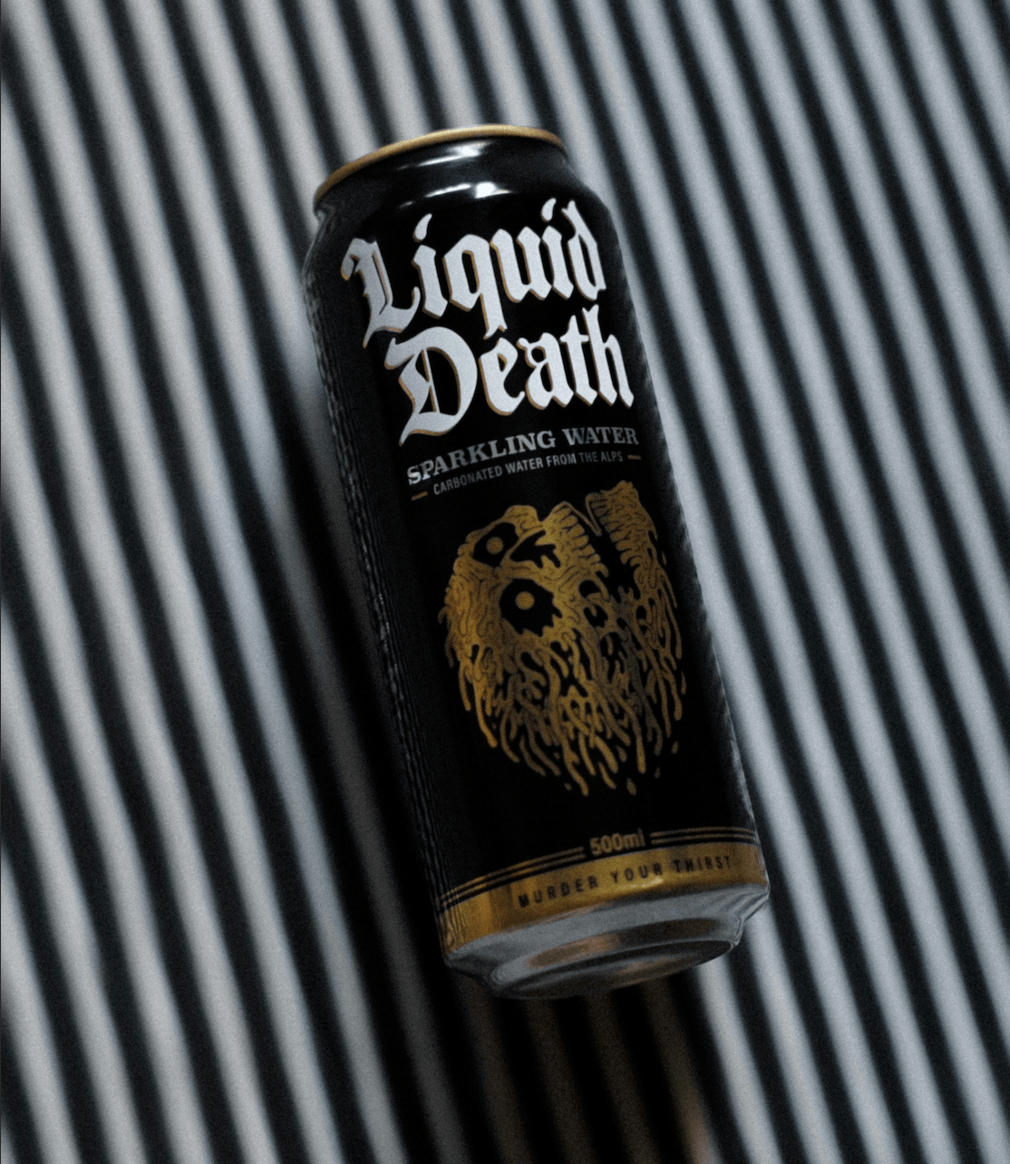
Liquid Death, a water brand unlike any other has blasted to the top of their industry by choosing their own unique path, voice, and identity.
Rule #3: "You must honor standard industry design conventions."
This is the rigid belief that if you're a wellness drink, you must look clinical, or if you're a cannabis brand, you must lean entirely into hyper-cliché counter-culture tropes just to prove what you are.
There is a massive difference between clarity and conformity.
Yes, your product must pass the 3-Second Rule. A consumer should be able to look at your container and understand the core offering within three seconds. If a customer has to play a guessing game to figure out if your product is a sparkling water or a cannabis beverage, the design fails.
But passing the 3-second rule does not mean cloning your neighbors on the shelf.
If you copy the visual shorthand of your industry, you force consumers to judge your product based on only one metric: price.
The brands standing out are the ones that break clichés while preserving structural clarity. That is the ultimate sweet spot of brand alchemy.

Tejas Tonic standing out and taking up space. By trading standard industry clichés for an unshakeable, culture-first identity, their brand easily outlasts the constant regulatory whiplash of the Texas market.
Rule #4: "Wait for environmental or legal stability before investing in your brand identity."
This one is incredibly relevant right now—especially for hemp and cannabis brands navigating the constant regulatory whiplash here in Texas.
Founders freeze. They hold off on premium packaging because they fear a legislative shift will make their product obsolete tomorrow.
But if your entire brand identity relies on a chemical definition, a specific cannabinoid percentage, or a volatile legal loophole, your business model is incredibly fragile.
Chaos is your canvas.
The brands surviving and thriving through every regulatory storm are the ones building culture-first brands.
When your design and visual identity communicate a lifestyle, an attitude, and a movement, that connection with your audience becomes unbreakable. If the laws shift, a culture-first brand can easily pivot its product lines from vapes to functional botanical beverages, and the community will seamlessly follow.
Less Friction. More Flow.
Traditional corporate strategies want you to play a defensive game. They want you to wait, to fit in, and to look like the safe, established crowd.
But your brand’s survival relies on your audacity to stand out.
Look at the epic brands occupying the shelf space you want—they aren't asking for permission, and they aren't hiding their personality.
When your visuals finally back up the raw energy and quality of your product, everything stops feeling like work. Your materials start doing the heavy lifting for you, turning passive shelf-scanners into lifelong fans.
Stop fighting your own brand. It's time to let your visuals catch up to your vision.
Ready to inject some real bite into your CPG or beverage packaging? I don't do safe, and I don't do beige. Let’s build an unforgettable, strategic custom identity that actually moves the needle.

A Quick Studio Glossary (Because I hate CLOUDY jargon):
Brand Debt: The cost of choosing placeholders or safe, cheap, unaligned visuals for now. It introduces continuous, subtle friction into your marketing—forcing you to fight an uphill battle to convince people your product is high-quality because your packaging isn’t backing up what you say.
Visual Alignment: When your look completely matches your vibe. It means your internal story, your attitude, and your physical package are all on the same team. When you achieve alignment, you eliminate market confusion, make your offer click instantly, and reduce the friction that kills your business momentum.
3-Second Rule: The maximum amount of time a customer gives a product to prove its worth. A consumer should look at your container, website, or label and instantly understand the core offering and tone within three seconds. If they have to play a guessing game to figure out what you are selling, your design loses the shelf battle.