The Alchemy of Standout CPG: 5 Brand Lessons from the Beverage Aisle
Let’s talk about the drink industry for a minute.
Lately, I’ve been completely immersed in the world of consumer packaged goods (CPG)—specifically cannabis, craft beer, liquor, and wellness beverages.
It’s an absolute whirlwind out there.
Between the constant regulatory roller coaster and thousands of new cans fighting for shelf space, standing out isn't just a goal.
It’s survival.
The beverage shelf is a brutal battleground.
But here is the secret- the absolute best branding advice doesn't come from dry, corporate textbooks.
It comes from the epic brands who are completely rewriting the rules of the grocery aisle.
Whether you’re launching a low-dose hemp tonic, brewing a localized craft beer, or building a high-ticket service business, the rules of visual engagement are exactly the same.
If you want to stop blending into the beige crowd, let’s analyze 5 standout brands crushing the space—and the exact alchemy you can steal from them today.
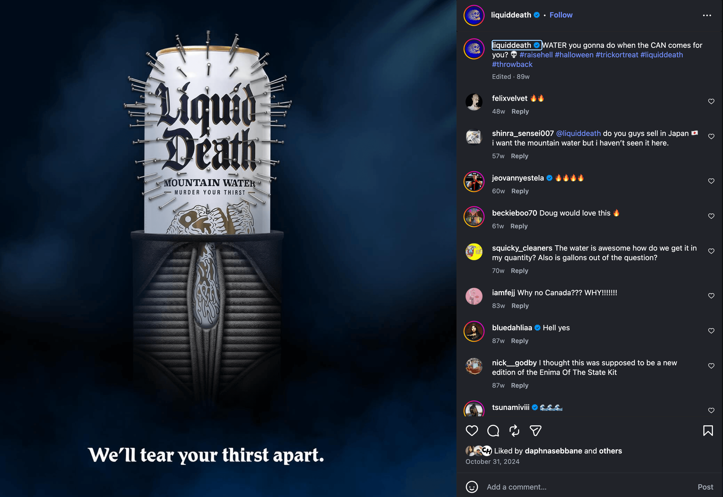
Image Source: @liquiddeath Instagram Account
Liquid Death- Double Down on an Epic Personality Niche
Water is the definition of a generic commodity.
For decades, the beverage industry told us water brands had to look like crisp blue glaciers, peaceful springs, or clinical laboratory science.
Liquid Death looked at that safety and threw it out the window.
They packaged regular water in a tallboy beer can, slapped a heavy metal skull design on the front, and used the tagline "Murder Your Thirst." They didn't try to make better water. They made water with an epic point of view.
The Takeaway-
You don't need a product that literally nobody else on earth can duplicate.
You need a brand identity with enough teeth to aggressively own a specific perspective.
When you try to appeal to the entire world, you end up appealing to no one.
Build a hyper-specific, polarizing personality that your ideal target audience will proudly wear like a badge of honor.
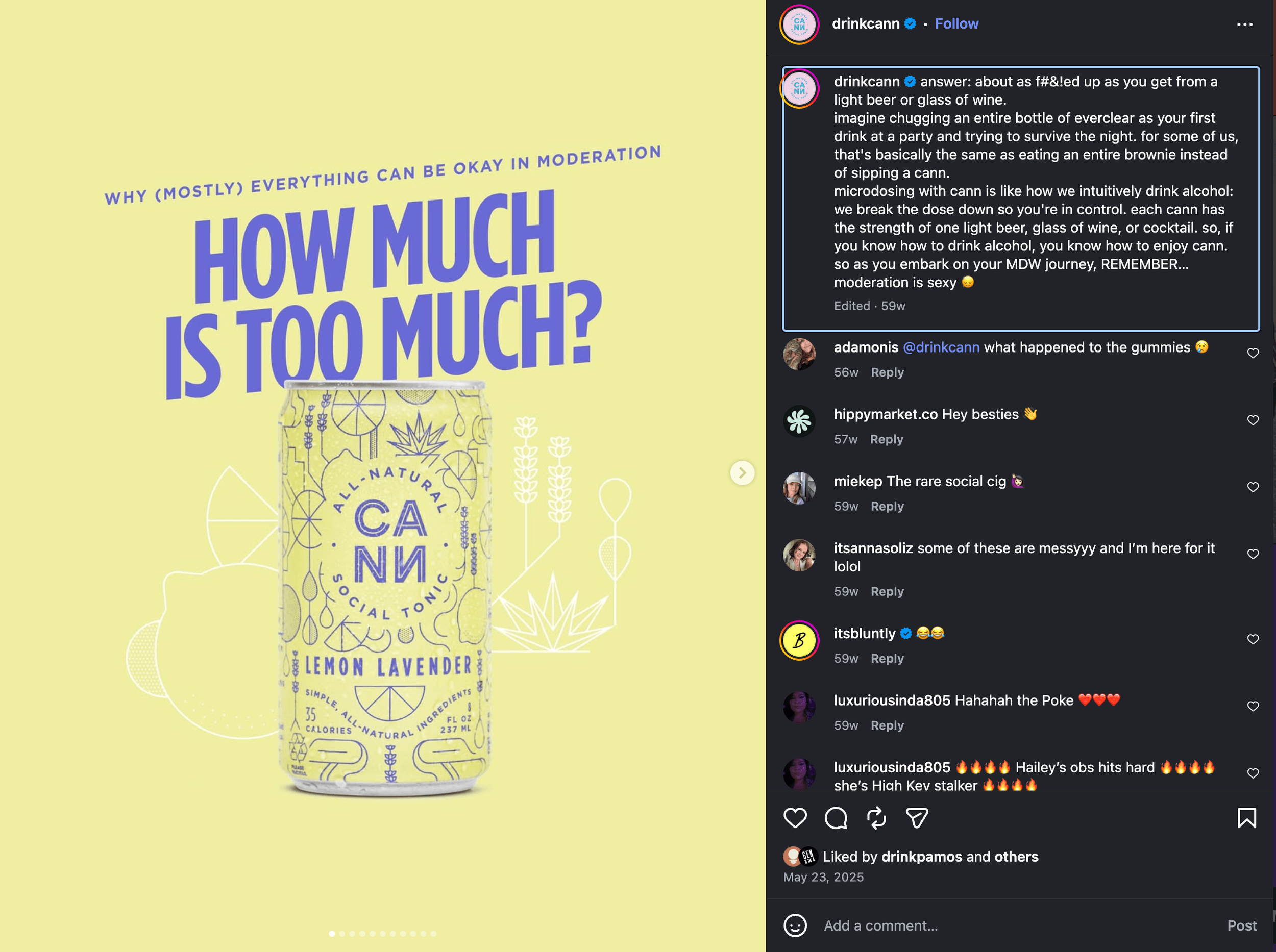
Image Source: @drinkcann Instagram Account
CANN- Own Your Category (Name the Paradigm Shift)
When CANN launched their microdosed THC and CBD drinks, they didn't want to just be another pot soda hidden in the back of a medical dispensary.
They looked ahead to the social shift toward the sober-curious crowd.
They built a product to appeal to people who wanted a fashionable, predictable way to take the edge off at a party—without the alcohol hangover.
Crucially, they named their own category— Social Tonics. They deliberately chose a short, punchy four-letter word so it could sit linguistically right next to "beer" and "wine" on a modern menu (CANN).
The Takeaway-
If you are trying to change how people think, you have to change how they talk about what you do.
Stop forcing your innovative ideas into old, tired industry definitions.
Define the category yourself, name the transformation, and structure your positioning so clearly that the old way of doing things instantly feels outdated.
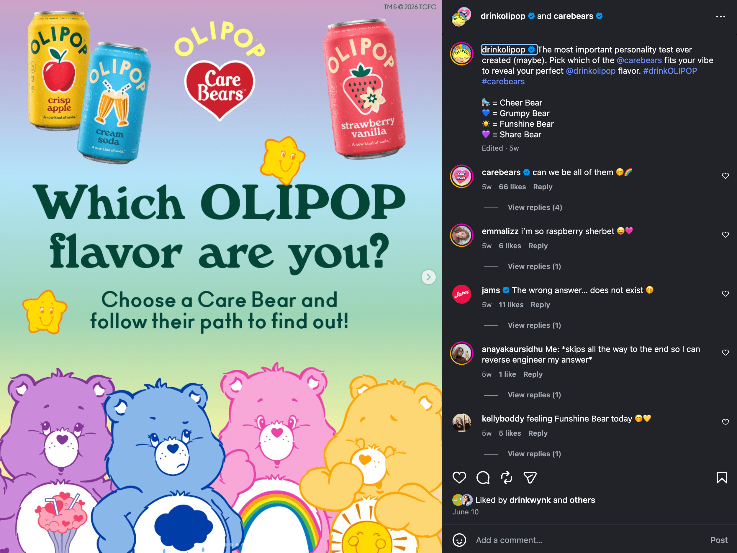
Image Source: @drinkolipop Instagram Account
Olipop- Reframe the Problem with Emotional Nostalgia
When you think of prebiotics, gut health, and digestive wellness, your brain usually goes to medicine cabinets, chalky supplements, or sour kombuchas.
Olipop flipped the script.
Instead of selling a dense, clinical lecture on biology, they reframed their drink as "a new kind of soda."
They formulated classic, nostalgic flavors like Vintage Cola, Cream Soda, and Strawberry Vanilla.
Then they wrapped them in bright, friendly, retro designs that evoke childhood memories.
They made wellness feel like an upgrade, not a chore.
The Takeaway-
Consumers don't buy pure logic— they buy how an experience makes them feel.
If your brand requires a customer to do heavy mental homework or feel like they’re giving up something they love, you're fighting an uphill battle.
Tap into what they already know and love, solve the hidden tension, and lead with delight rather than a lecture.
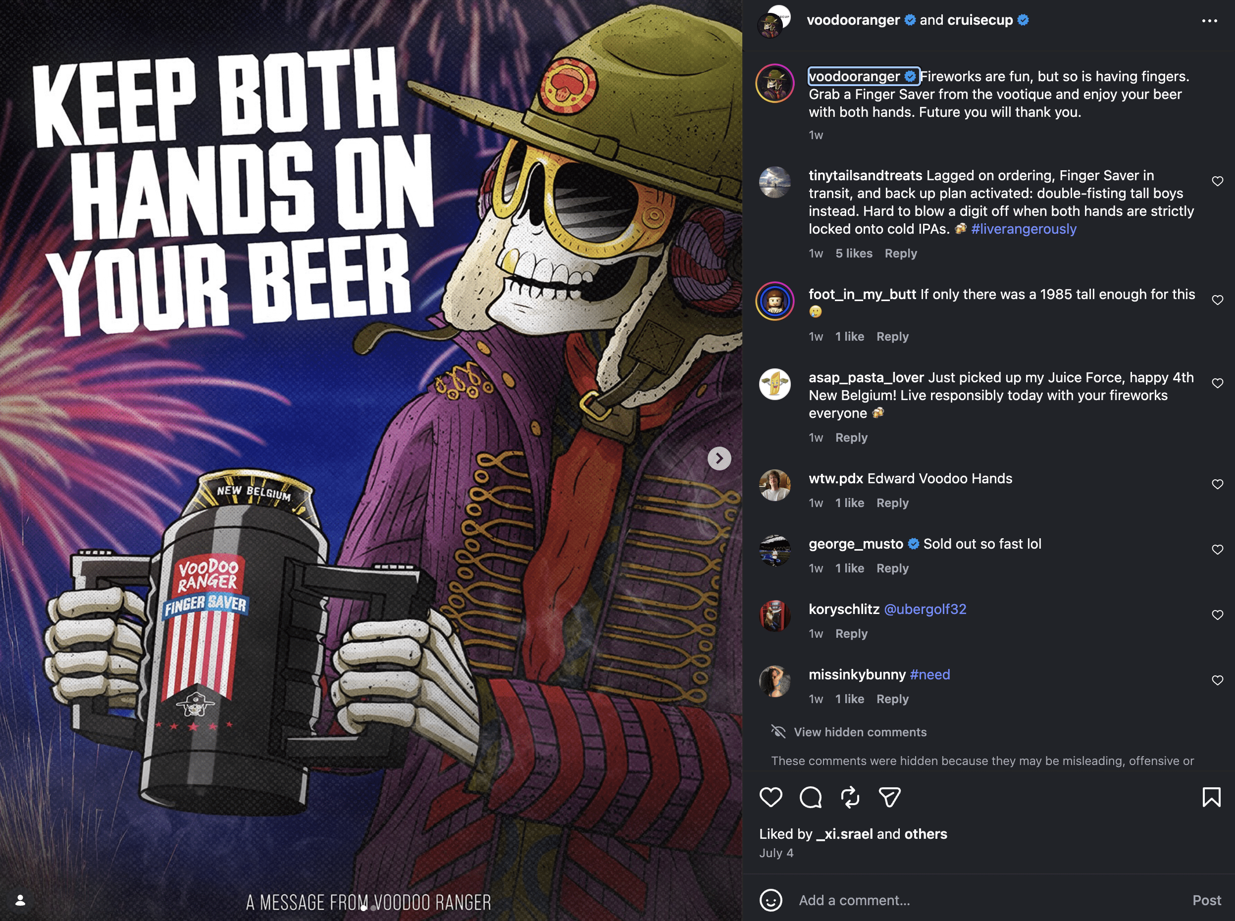
Image Source: @voodooranger Instagram Account
Voodoo Ranger (New Belgium Brewing)- Give the People an Icon to Rally Around
The craft beer aisle is a chaotic, noisy mess.
Every single brewery is trying to out-design the next with neon color palettes, dense blocks of text, or abstract art that feels less a bit messy and confusing.
New Belgium radically pivoted by cutting through the noise and elevating a singular, unforgettable visual anchor- a sarcastic, vibrant, hype-beast skeleton mascot named Voodoo Ranger.
Instead of hiding the mascot in a corner, they put him front and center across their entire IPA lineup, effectively transforming their packaging into a comic strip character people genuinely look forward to seeing (their Instagram literally reads more comic-book strip than ad roll).
He isn't just a logo— he’s an entire brand sub-culture with his own social media presence, personality, and merch.
The Takeaway-
Abstract confusion is expensive.
If your audience looks at your visual ecosystem and can’t find a single cohesive, grounding element, they are going to keep right on scrolling (consistency is KEY!)
You don't need a cartoon mascot to make this work, but you do need a distinct, repeatable visual icon or structural anchor woven into your brand guidelines.
Give people an unmistakable flag to rally around, pass the 3-second rule with flying colors, and stop making your audience guess who you are.
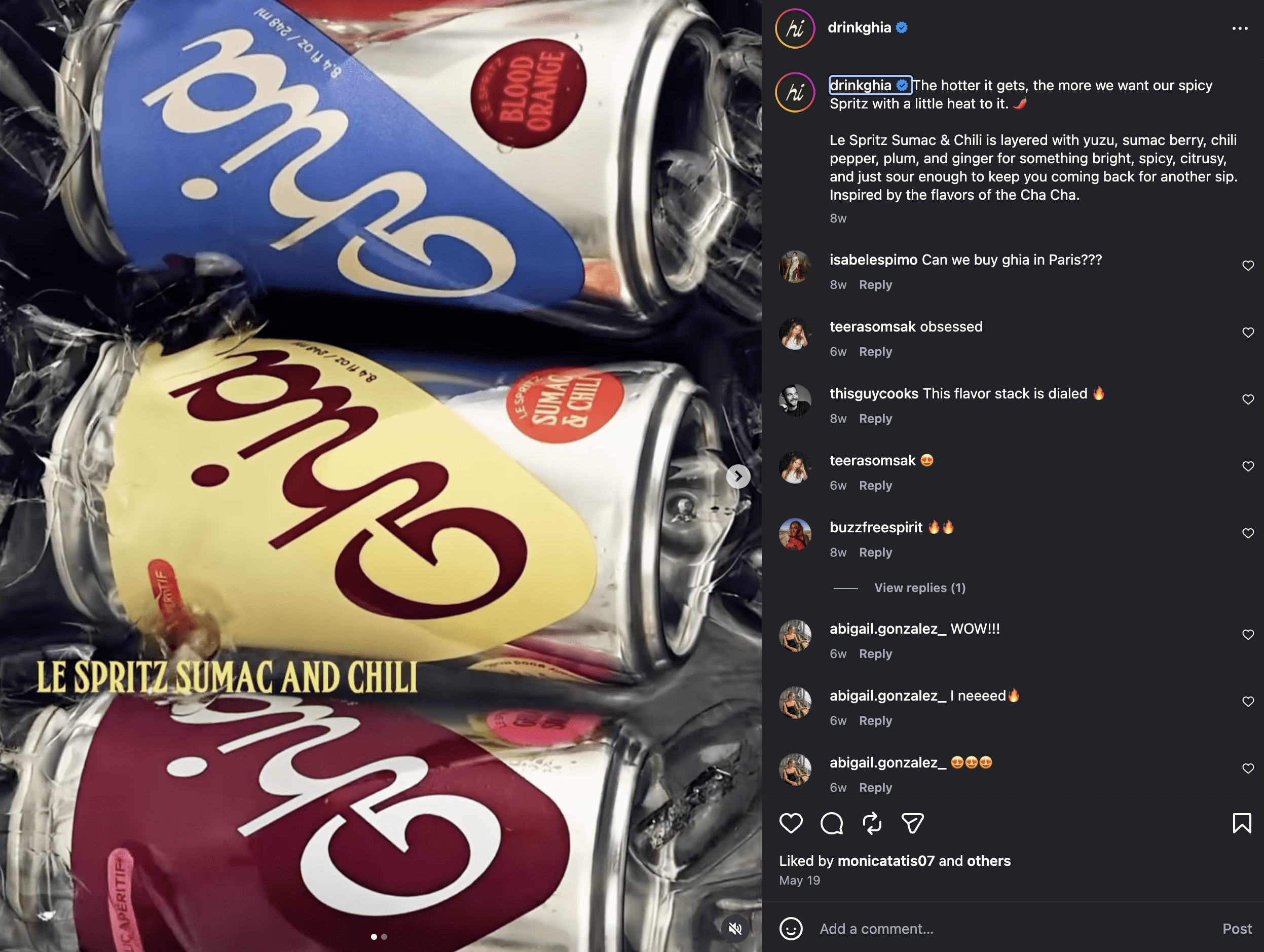
Image Source: @drinkghia Instagram Account
Ghia- Treat Your Brand as a High-End Lifestyle, Not a Substitute
Non-alcoholic spirits and apéritifs often make the massive mistake of positioning themselves purely by what they lack—marketing themselves as fake liquor.
Ghias completely rejected the comparison.
Inspired by Mediterranean apéritivo culture, they built an incredibly chic, art-forward, premium brand that stands entirely with its own design.
They didn't design a product to hide in the shadow of alcohol.
They built an upscale lifestyle invitation that people are genuinely proud to display on their bar carts.
The Strategic Takeaway-
Never position your business as the alternative choice or the budget version of a competitor.
Own your worth.
Build an aesthetic and an experience that commands respect based on its own unique identity.
Stop letting other people's standards dictate the value of the empire you are building.
The 3-Second Rule: Is Your Brand Ready?
No matter which of these brand lessons resonates with you, it all comes down to a simple reality- The 3-Second Rule.
The internet gives you the exact same three seconds that a crowded refrigerator door gives a seltzer can.
If a viewer looks at your website headline, your social media, or your product packaging and can't instantly tell what it is or who it's for, you've already lost them.
When your visuals actually back up what you’re saying, you stop getting in your own way.
It’s about making sure your design and your offer are on the same team—less friction, more flow.
Audit Your Vibe
Go look at your business presence today with completely fresh eyes.
Are you trying so hard to look clinical, safe, and tidy that you’ve accidentally deleted your entire personality?
You don’t need a massive corporate budget to make a pivot.
You just need to stop blending into the beige crowd, speak like a real human being, and get your brand some teeth.
Ready to inject some serious bite into your visual identity? Let’s stop playing safe and start building something undeniable. Explore our recent Case Studies to see how we translate raw brand strategy into award-winning visual alchemy, or reach out directly to map out your brand’s next big evolution.