
The Death of Boho-Beige: How 3 Cannabis Brands Broke the Mold (And How to Steal Their Strategy)
Walk into almost any Texas dispensary right now, and you’ll notice an overwhelming visual pattern.
First, there’s a sea of forest green punctuated by generic, vectors of marijuana leaves. Right next to it, there’s a wave of muted, boho-beige packaging trying entirely too hard to look like a sterile medical pharmacy or a minimalist luxury wellness brand.
When 80% of an industry defaults to the exact same visual language, playing it safe isn't safe anymore. It’s boring. It’s blending in. And in retail, blending in means out of sight, out of mind.
The cannabis and CPG brands that are absolutely dominating their categories didn't get there by playing by the unwritten rules of their industry. They got there by ditching the expected green, leaning into bold, distinct visual identities, and giving their brand real strategic teeth.
If your product looks like every other bag or can on the shelf, you’re trapped competing on price. But when you build a distinct visual world backed by strategy, you compete on desire.
Here are three brands that broke away from the traditional cannabis branding mold—and the exact takeaways you can steal to make your brand impossible to ignore.
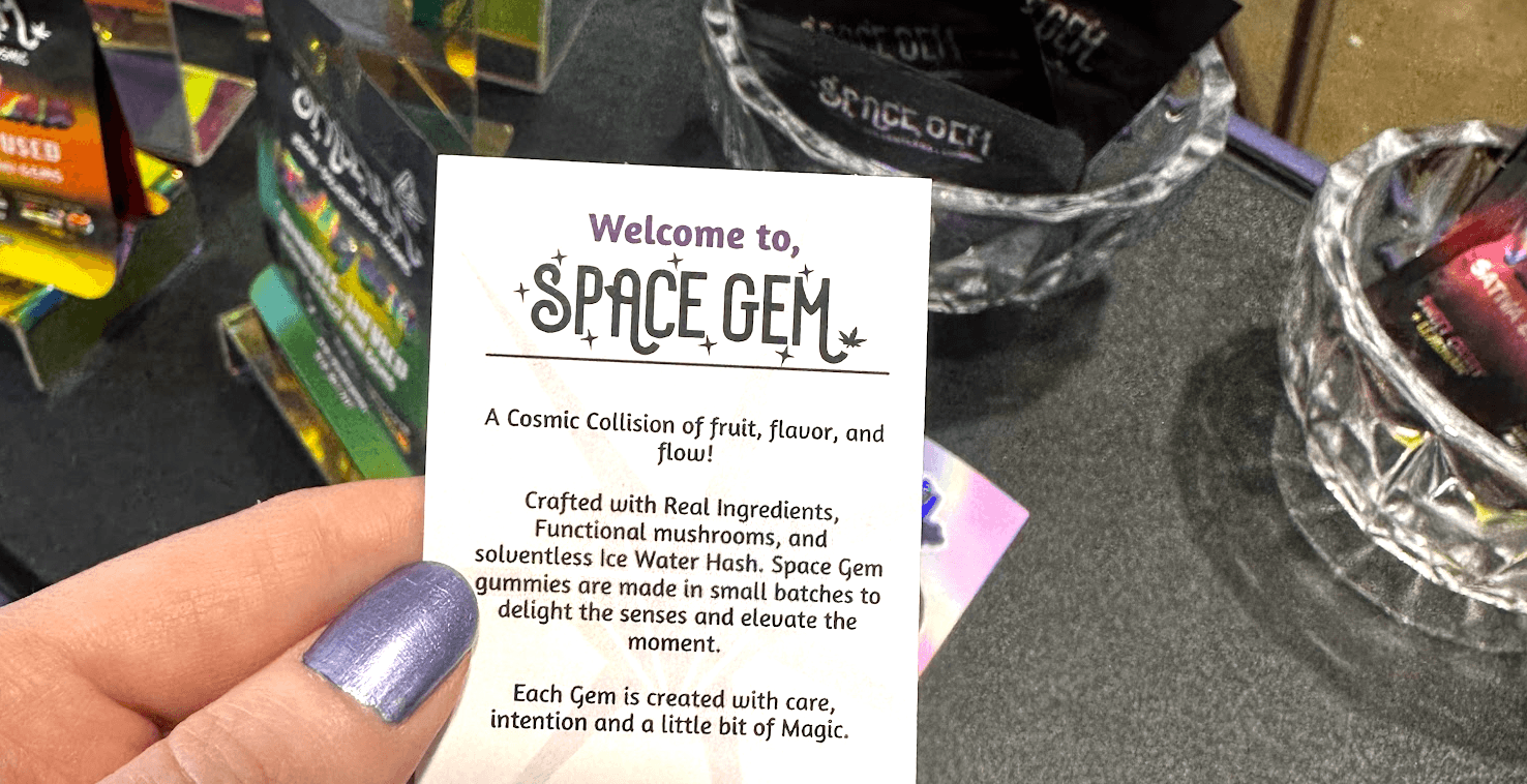
1. SpaceGem: Cosmic Art Meets Sustainability 🪐
SpaceGem didn’t attempt to fit into the green canna-leaf mold, nor did they try to look like an apothecary. Instead, they leaned heavily into vibrant, psychedelic cosmic art filled with custom, fun illustrations.
Beyond aesthetics, they tap into the unboxing experience with their gummy line featuring fully recyclable, collectable tins.
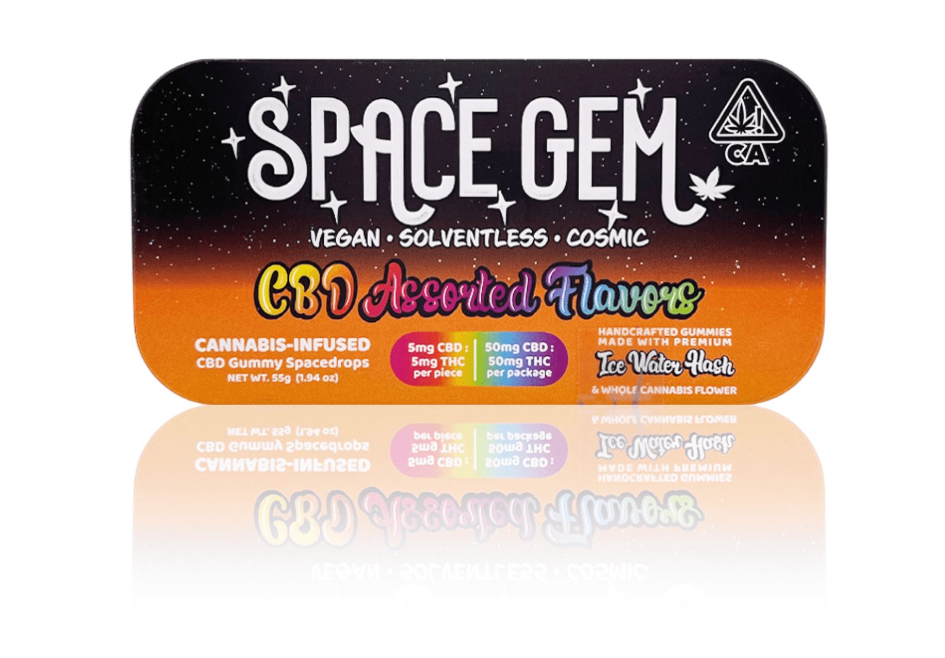
Why It Works
Packaging is a customer’s very first physical touchpoint with your brand. By replacing generic single-use bags with tactile metal tins and vibrant artwork, SpaceGem signals quality and sustainability before you even open the lid.
I have a SpaceGem tin on my desk right now that I will honestly never throw away because it feels like a piece of art. They turned throw-away consumer waste into tiny, branded treasures that live indefinitely in consumers' homes.
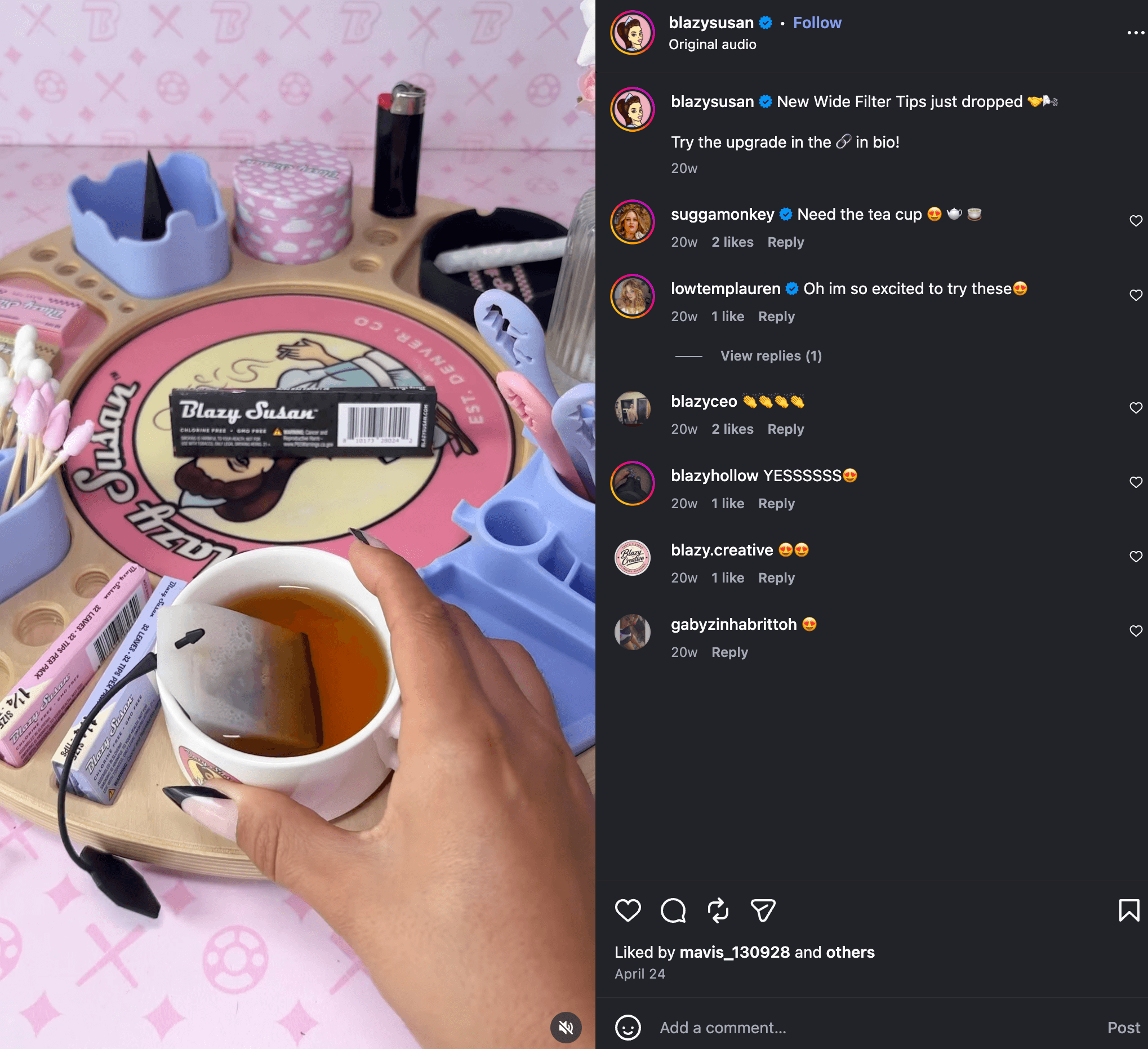
2. Blazy Susan: Owning a Signature Color to Build a Movement 🩷
Before Blazy Susan hit the scene, the smoking accessory aisle was a monotonous wall of brown, black, and camo. It was an aesthetic designed exclusively for a hyper-masculine demographic, ignoring a massive portion of the market.
Blazy Susan disrupted the entire category by launching unapologetic, signature bright pink rolling papers and accessories.
Why It Works
Pink became an immediate visual beacon across dispensaries and smoke shops worldwide. Seeing someone roll with a pink paper ceased to be just a product choice—it became an instant signifier for an entire underrepresented demographic (hello, ladies!) that had been routinely overlooked by traditional brands for decades.
Blazy Susan didn't just pick a color— they claimed a visual trigger that transformed a commodity product into a lifestyle movement.
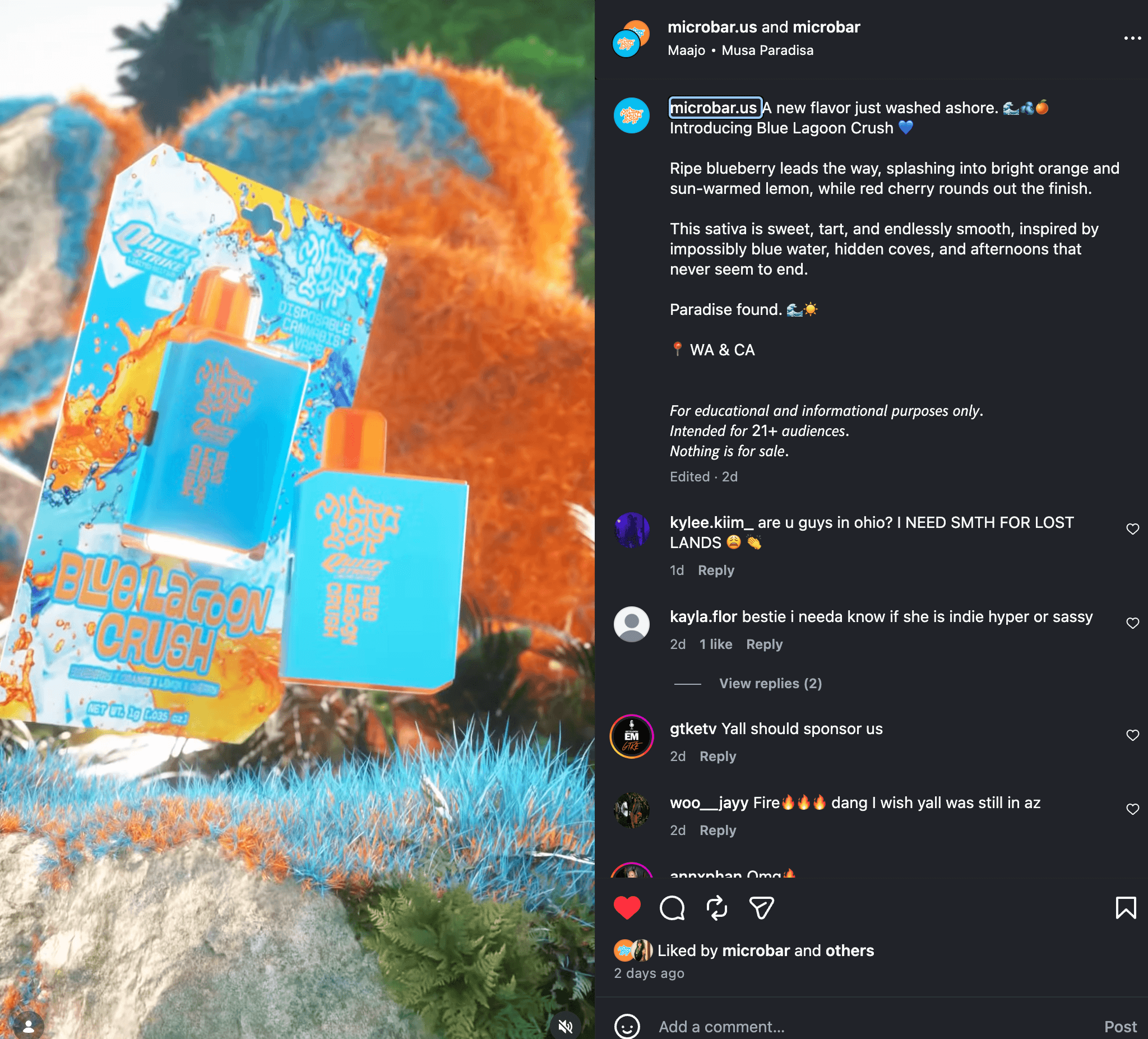
3. Microbar: Sleek Consumer Tech Meets High-Vibe Packaging ⚡
Most disposable vapes on the market fall into one of two traps: they look like cheap black plastic medical devices, or they look like clunky industrial batteries.
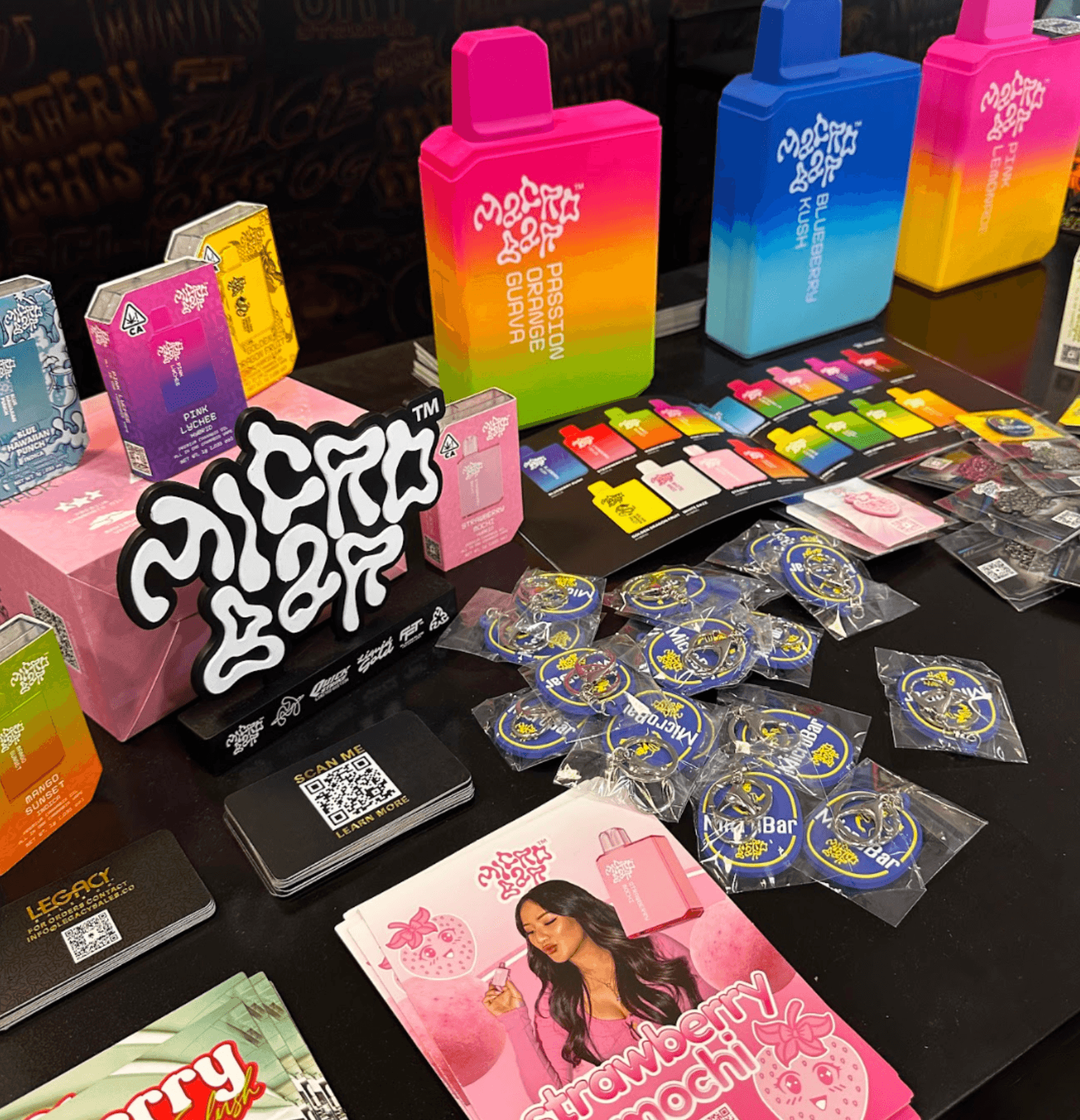
Microbar took a completely different path by borrowing design cues from consumer tech gadgets and candy packaging. They developed bright, pocketable, color-blocked hardware paired with dual-airflow technology. The result feels less like a traditional vape and more like a sleek, high-end lifestyle accessory.
Why It Works
Microbar effortlessly nails the 3-second shelf test. You can identify a Microbar product from ten feet away purely by its silhouette and high-contrast color palette. The product color is indicative of the flavor.
By prioritizing tactile hardware design alongside bold graphics, the product feels premium, modern, and fun in the customer’s hand. They elevated a standard device into something people are proud to pull out of their pocket.
3 Strategic Packaging Principles Any Brand Can Steal Today
You don't have to be in the cannabis space to apply these exact positioning strategies to your CPG or retail brand. Here is how to audit your own visual identity:
1. Claim a Signature Visual Trigger
If you covered up your logo on the shelf or on your website, would a customer still recognize your product by color, shape, or texture alone? Stop defaulting to the "safe" or "standard" color schemes in your niche. Choose a distinct visual footprint that turns your competitors invisible by comparison.
2. Design for the Coffee Table, Not Just the Shelf
If your packaging gets tossed in the trash the exact second it’s opened, you are throwing away valuable post-purchase brand equity. Aim to create packaging that customers want to keep on display, share with friends, or feature on their social feeds.
3. Treat Packaging as Part of the Product Experience
Whether it’s a heavy-weight tactile tin, a custom die-cut label, or custom-molded hardware, the physical sensation of holding your product dictates its perceived value. How it feels in hand directly dictates how much a customer believes it is worth.
The Bottom Line
When you look like everyone else in your industry, you are forced to compete on price, discounts, and margins. But when you build a distinct visual world backed by real brand strategy, you stop competing on price—and start competing on desire.
Over to you: What is one visual cliché or safe default in your industry that you’re ready to kill off this year?
Keep on evolving!
- Katie