Curious Therapist
Brand Strategy, Visual Identity, & Web DESIGN
Overview
Curious Therapist is a platform offering continuing education (CEU) courses for mental health professionals — a space that requires both trust and approachability. The challenge was to visually express expertise and learning in a way that feels supportive rather than intimidating.
I worked with the founder to craft a brand identity, illustration system, and web experience that communicates clarity, warmth, and professionalism in a complex and content‑rich environment.
The Challenge
Continuing education is inherently informational — but not always engaging. Curious Therapist needed:
A brand identity that feels trustworthy to professionals but still approachable and refreshing
A system of illustrations that supports educational content without feeling generic
A web experience that simplifies navigation and learning pathways
An identity system that could span courses, marketing materials, and digital touchpoints
The problem wasn’t just visual differentiation — it was about making complex learning feel intuitive, human, and memorable.
My Role
Brand strategy & positioning
Visual identity system
Custom illustration system
Web design
Template system for future course graphics and marketing assets
I collaborated directly with the founder to define a design language that honors both the rigor of education and the warmth of supportive learning.


Strategy
The brand system was built with several priorities:
Clarity at every touchpoint: visuals should support understanding, not distract
Warmth and accessibility: making professionals feel welcomed, not overwhelmed
Scalability: a system that can expand with future course offerings and content streams
We built an integrated brand identity that balances professional tone with human‑centered aesthetics.


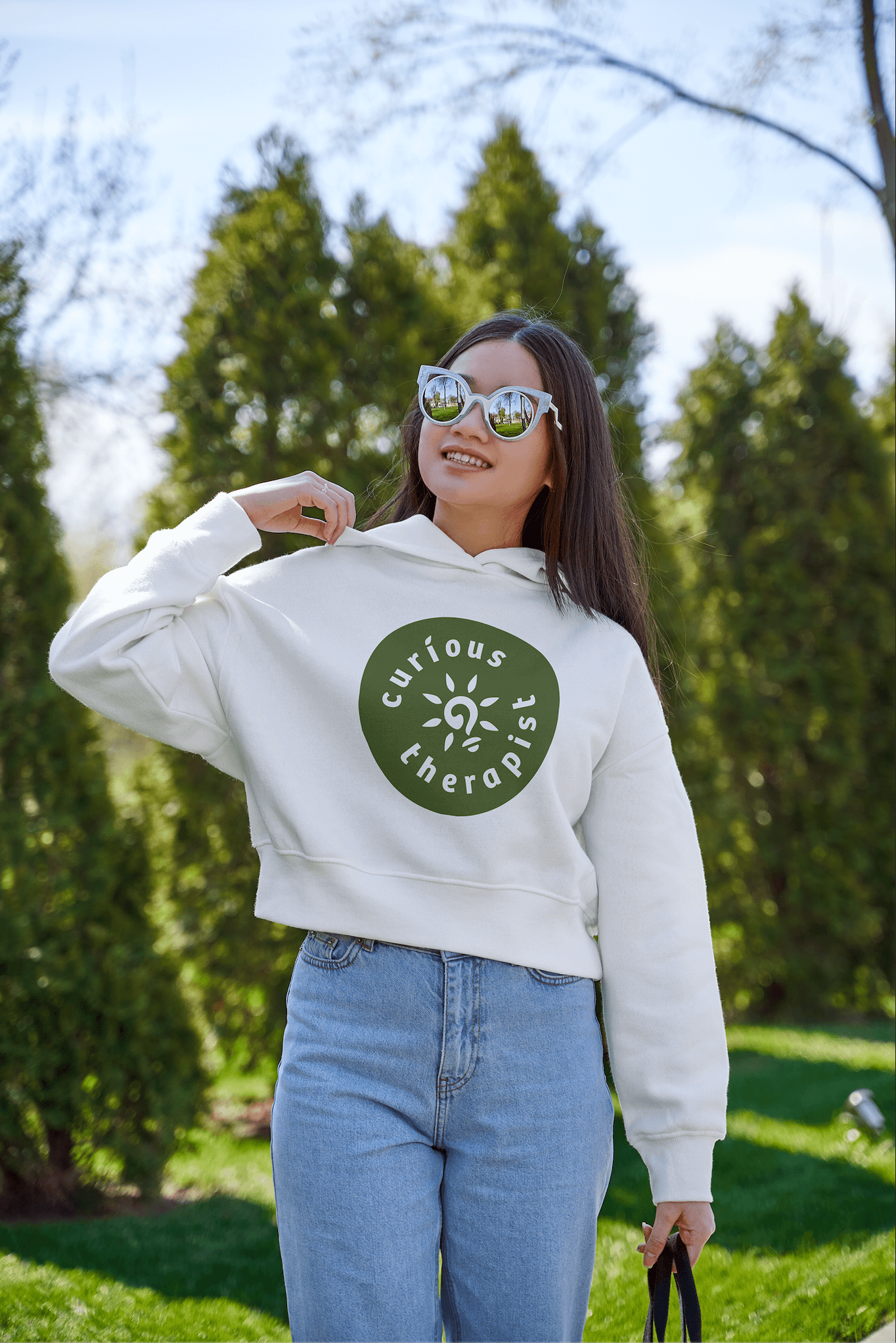
Visual Identity
Logo: The Curious Therapist logo pairs a clean, modern typeface with a simple yet meaningful visual metaphor. A question mark is integrated into a lightbulb icon, symbolizing curiosity leading to growth and excellence. The logo feels approachable yet professional, creating instant resonance with mental health professionals. The orange rays radiating from the bulb represent bright ideas and the excitement of learning, while keeping the design simple and recognizable across all media.
Color Palette: Warm, inviting shades of orange and blue balance energy and trust. Orange conveys curiosity, creativity, and innovation, while calming blues provide reliability and professionalism — reflecting the brand’s mission to be both inspiring and credible.
Typography: Clear, legible, and slightly unique, the typeface ensures readability across long-form content while standing out from competitors. It reinforces the brand’s accessible, trustworthy tone, blending warmth with professional authority.
Symbol: The integrated question mark/lightbulb acts as a visual shorthand for curiosity sparking learning and growth. It emphasizes the journey of discovery that therapists experience on the platform, while the rays amplify energy and optimism. The symbol is versatile for use in digital, social, and print contexts.
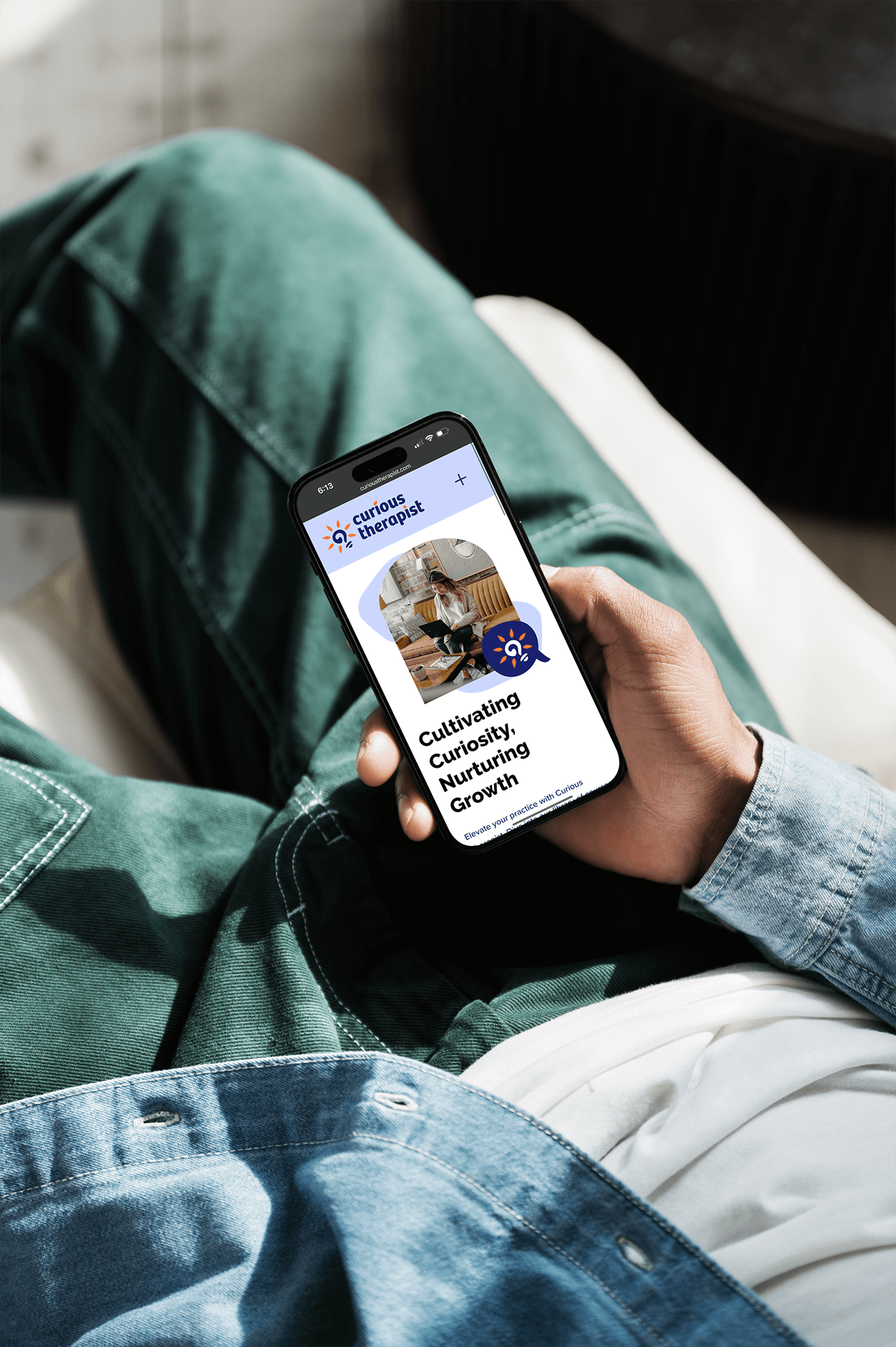
Web Design
The website was designed with a learner-first mindset, prioritizing clarity, ease of navigation, and a supportive experience for busy mental health professionals.
Course discovery made simple: Users can easily browse and access CEU offerings, with intuitive layout and content hierarchy guiding engagement.
Responsive and accessible design: Optimized for desktop and mobile, ensuring therapists can interact with the platform anytime, anywhere.
Custom illustrations: Branded assets help translate abstract concepts into digestible visuals, reinforcing learning pathways and adding personality to the experience.
Supportive tone throughout: Design elements—from layout to iconography—create a welcoming, human-centered experience without sacrificing professionalism.
The result is a site that feels structured, friendly, and confident, making learning approachable and enjoyable while aligning fully with the Curious Therapist brand.
Results
Curious Therapist now has a cohesive, professional, and approachable brand that clearly reflects its mission: supporting mental health professionals through accessible, engaging continuing education.
The logo is memorable and versatile, performing seamlessly across digital, print, and social platforms.
Custom illustrations enhance the learning experience, making abstract concepts tangible and engaging.
The web experience is intuitive and supportive, helping therapists find, understand, and engage with courses efficiently.
This project demonstrates how intentional design can empower learning, foster trust, and strengthen community. Curious Therapist now has a visual and digital identity that supports its growth, making CEU learning more enjoyable, accessible, and human-centered.
Client Testimonial
“Katie has been an absolutely incredible partner. Her creativity, organization, follow-through and responsiveness were top-notch, and she was fun to work with, to boot! She went above and beyond to ensure I was happy with the results, and worked hard to make the process easier wherever possible. I'm so proud of the Curious Therapist brand and how it reflects our personality and core values. She is a professional in every sense of the word, and I can't recommend her enough!"
— Melissa Quackenbush, LCSW | Founder, Curious Therapist
What This Project Means to Me
Curious Therapist is a project that shows how design can support learning. It wasn’t about decoration — it was about building systems, structure, and visual clarity so that professionals feel confident and supported.