Lunk + Hancy
Brand Strategy, Visual Identity, & Web DESIGN
Project Overview
Lunk + Hancy is an ultra-contemporary art gallery that needed a refined and flexible visual identity to represent both its artistic vision and its role as a cultural connector in its community. With a mission to highlight women and minority artists through original, insightful perspectives, the gallery's vision is to foster an inclusive space for fine art, showcasing talent with a unique focus on contemporary, political, and historical narratives.
I partnered with the gallery to craft a brand identity and web design that communicates its artistic excitement without sacrificing clarity — striking a balance between creative expression and professional presentation.
The Challenge
Lunk + Hancy was operating in a space where first impressions matter and audiences range from local art enthusiasts to collectors and institutions.
The gallery needed:
A brand identity that could visually express artistic depth while remaining accessible
A digital presence that clearly communicates exhibitions, artists, and events
A system that works across both physical materials (print, signage) and digital touchpoints
The core problem was not simply a blank slate to showcase art— it was about creating a distinctive identity that would resonate with the gallery’s affluent, art-savvy audience while reflecting its values of high-quality, unpretentious, and memorable art experiences. Lunk + Hancy needed a brand voice and visual identity that balanced elegance with accessibility, and competence with fun, establishing a visual language that could flex with artistic programming while building trust and recognition in the community.
My Role
Brand strategy & positioning
Visual identity system and toolkit
Logo suite
Web design via my One Day Website Package
Digital and print asset design
I led the project from discovery through execution, working closely with the gallery’s owner to translate their voice into design systems that elevate the brand consistently across mediums.


StraTEGy
Lunk + Hancy’s brand needed to be as dynamic and multi-dimensional as the artists it represents. The strategy was to create a visual language that could elegantly flex across exhibitions, artists, and programming while remaining instantly recognizable and approachable to its affluent, art-savvy audience.
Key design intentions included:
Juxtaposing elegance and playfulness: conveying sophistication without pretension
Balancing artistic depth with accessibility: ensuring both collectors and casual visitors could engage meaningfully
Creating a flexible, modular system: the brand needed to work seamlessly across print, digital, and environmental applications
Communicating values visually: feminist energy, inclusivity, and artistic originality needed to shine through design choices
Rather than imposing a static identity, the system was designed to adapt with the gallery’s evolving exhibitions while maintaining a consistent, confident presence. Every design decision—from color palette to typography to the logo symbol—was rooted in supporting the gallery’s mission of elevating women and minority artists through original, thought-provoking perspectives.


Visual Identity
The identity system is bold, memorable, and deeply purposeful, capturing Lunk + Hancy’s unique character and cultural voice.
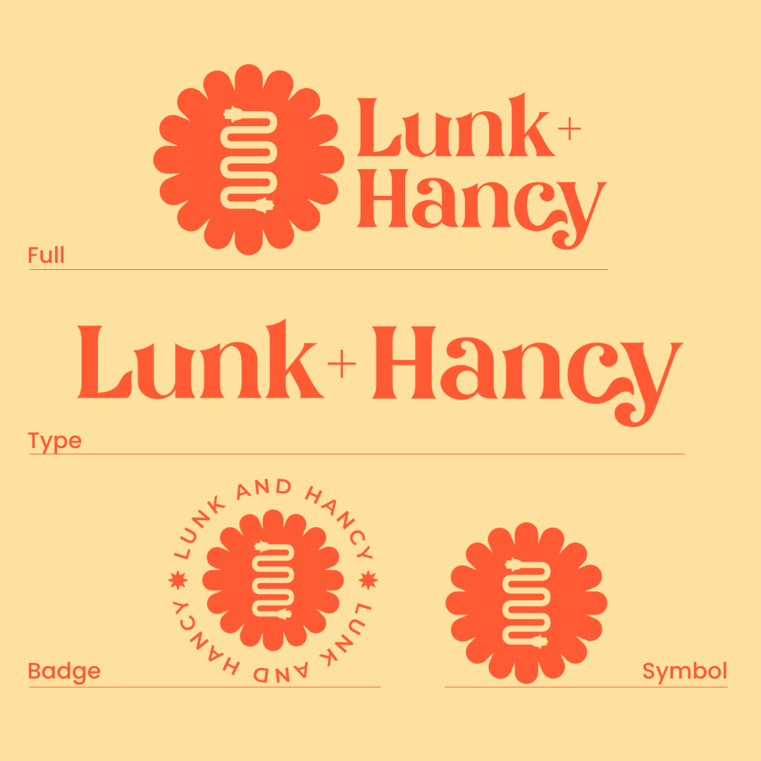
Logo: A custom typeface paired with a distinct brand symbol balances strength with approachability. Bold yet soft, iconic yet friendly, the logo communicates that professionalism and femininity are not mutually exclusive.
Color Palette: The palette walks the line between serious and playful. Sophisticated tones provide grounding, while vibrant accents evoke the gallery’s feminist energy and the freshness of its curatorial vision.
Typography: Elegant and dynamic, the typeface features subtle swirls and wave-like flows that reference the gallery’s beach town roots. Letterform details like the connecting curves in “C” and “Y” or the harmony of “U” and “N” give the brand a handcrafted, thoughtful personality.
Symbol: Inspired by native tribal flowers, the symbol incorporates a snake-like form representing the artist’s journey from inspiration to public display, flanked by two hamsa hands symbolizing protection, strength, and empowerment. This emblem conveys the transformative power of art—from creation to engagement—and scales beautifully across social media, print, and environmental graphics.
Every element was intentionally crafted to be adaptable, memorable, and meaningful, reflecting the gallery’s ethos and giving it a visual system as layered as the art it champions.
Web Design
The Lunk + Hancy website needed to act as both a gallery window and a curatorial tool. Using my One Day Website Package, we created a 5-page Squarespace site that is sleek, immersive, and intuitive.
Key priorities included:
Showcasing exhibitions and artists: a clear hierarchy that invites exploration without overwhelming visitors
Guiding audiences naturally: intuitive navigation across artists, events, and press ensures ease of access for both collectors and art enthusiasts
Reflecting the brand personality: layouts, imagery, and interactions all echo the vibrancy and sophistication of the visual identity
Seamless responsiveness: every element was crafted for consistency across desktop, tablet, and mobile platforms
The final web experience captures the gallery’s energy and invites engagement while staying aligned with the identity system—bold, approachable, and adaptable.
Outcomes
While Lunk + Hancy operates in a niche and community‑oriented space, the brand system has helped the gallery:
Present a more professional, cohesive face to collectors, artists, and civic partners
Maintain visual consistency across exhibitions and communications
Elevate its cultural presence both locally and digitally
The identity system supports ongoing programming without needing frequent redesign, making it a practical tool for long‑term use.
Client Testimonial
“Working with Katie was an edifying creative experience. Her questions served as guidance for my own ideas, and her enthusiasm for solving problems quickly and intelligently was (particularly in hindsight) so critical to our early progress. The early stages of any brand of business development are so key, but can also feel so 'sticky' or slightly (very) overwhelming. Katie's ability to get you to a stage of clarity and readiness is really spectacular. She uses so many of your own concepts and ideas to present you with cohesive and optimal design results oh-so-quickly. Would work with Katie on any future design or brand/business concepts in a heartbeat!”
— Victoria Battles, Founder of Lunk + Hancy
Why This Project Matters
Lunk + Hancy is a brand that lives at the intersection of art and community. I’m proud of this work because it demonstrates how thoughtful design— grounded in clarity and adaptability— can elevate artistic expression while strengthening a cultural institution’s presence.