MiD
Brand Identity & Packaging System
Overview
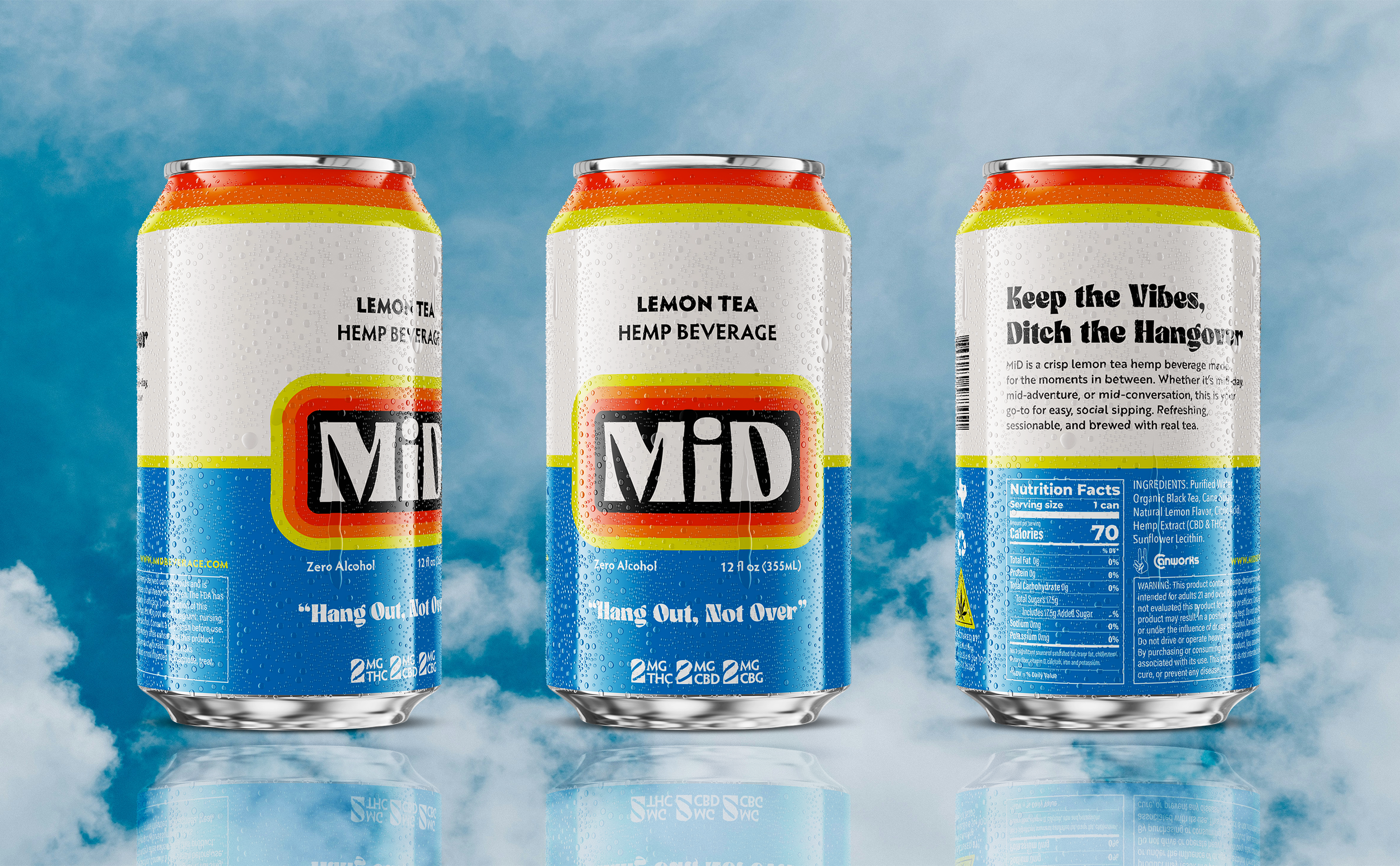
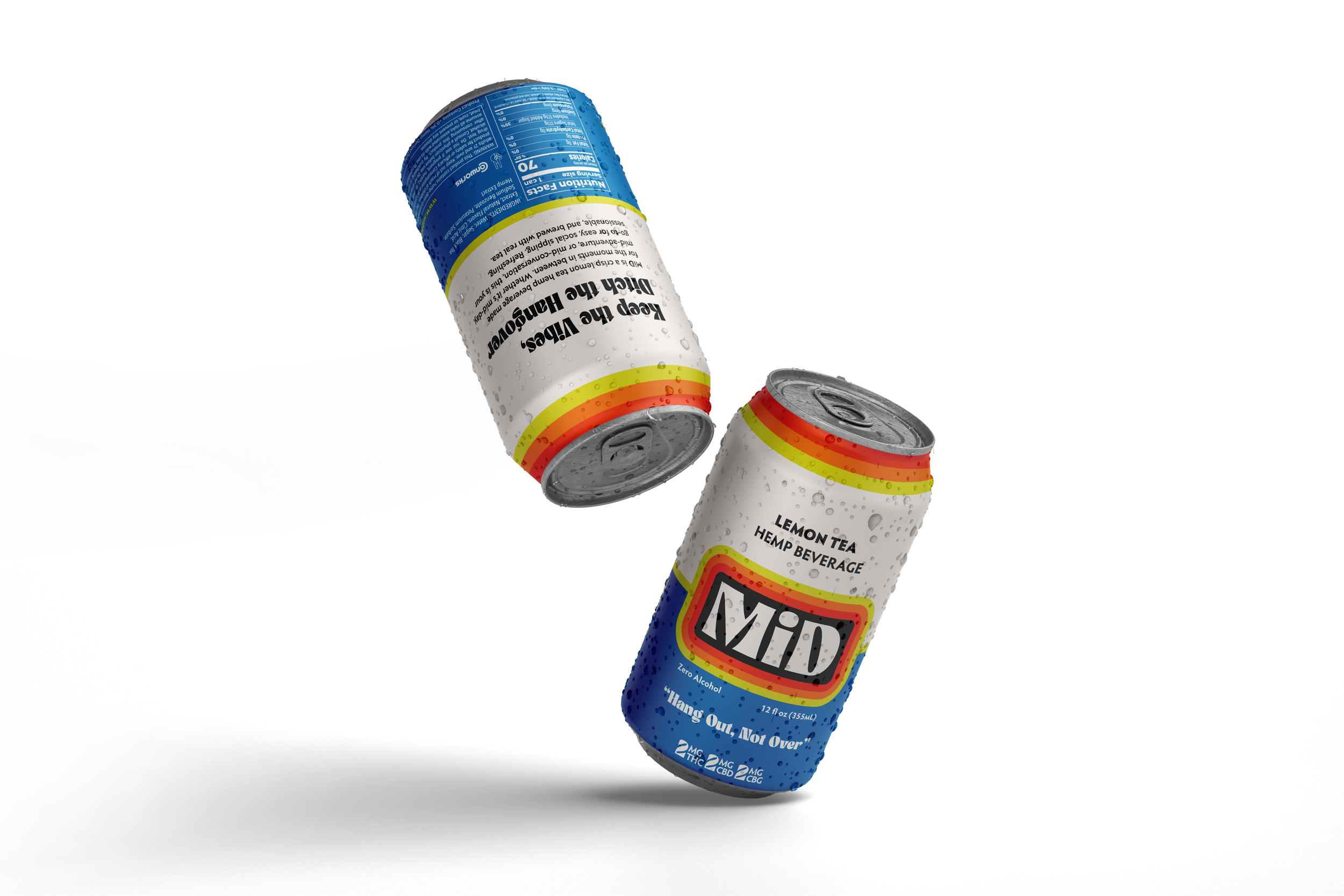
MiD is a sessionable lemon tea hemp beverage formulated with 2MG CBD, THC, and CBG — designed as a low-dose, crushable alcohol alternative.
Created and manufactured by BevPro Solutions, MiD was developed to fill a clear gap in the cannabis beverage market: an approachable, easy-sipping option for consumers who don’t want high dosage, overwhelming effects, or heavy cannabis branding (in other words, people like me!)
The brand tagline says it simply—
Hang Out, Not Over.
I partnered with the team to build MiD from the ground up— developing a full visual identity and packaging system designed for retail, on-premise environments, and statewide distribution.
The Challenge
The cannabis beverage market is rapidly expanding— but most brands follow a predictable formula:
High dosage
Loud cannabis cues
Similar pricing structures
Edible-first brand extensions
MiD needed to:
Introduce a low-dose, sessionable format
Lower the barrier of entry for non-traditional cannabis consumers
Feel approachable, not intimidating
Stand out in both retail coolers and on-premise settings
Build a system that could expand into future SKUs
The opportunity wasn’t just to design something cool.
It was to carve out a new lane.
MY ROLE
Brand strategy & positioning
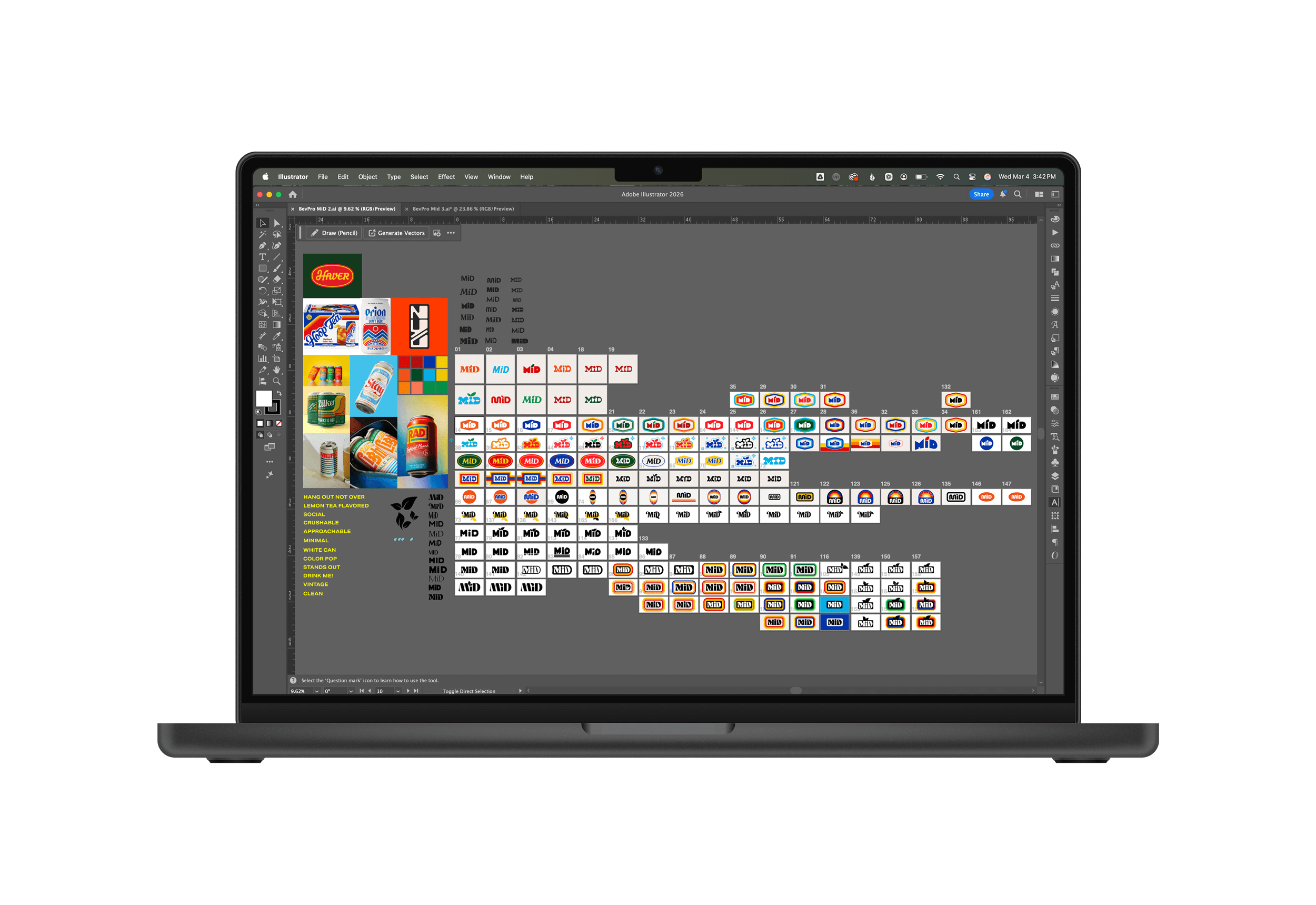
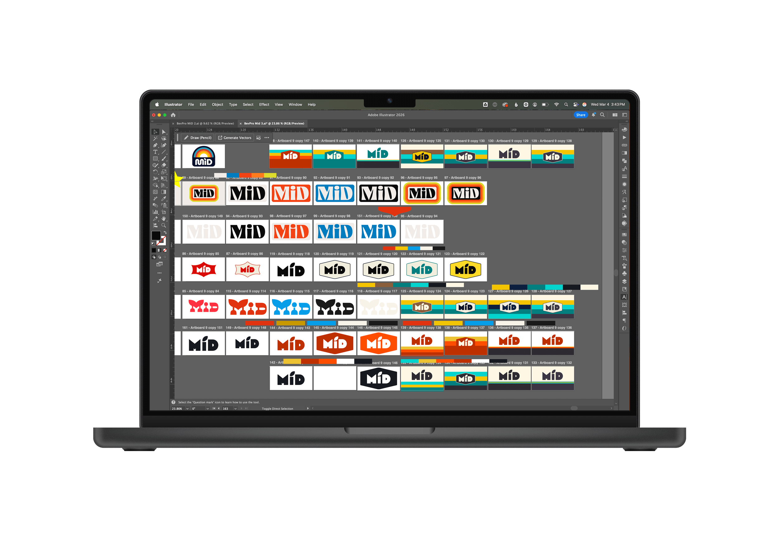
Logo suite development (adaptable logo)
12oz can packaging design
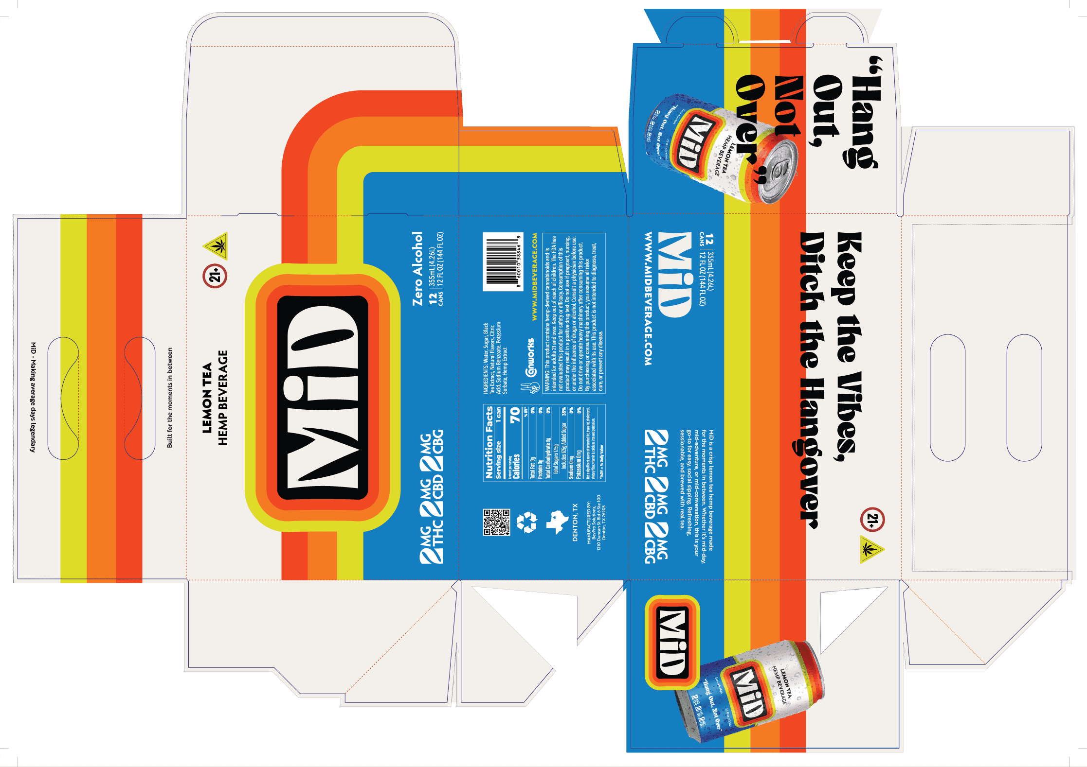
12-pack case packaging system
Retail-ready production files
I led the creative direction end-to-end, ensuring the brand balanced compliance, shelf impact, and scalability.
STRATEGY
MiD is not a heavy cannabis brand.
It’s a social beverage.
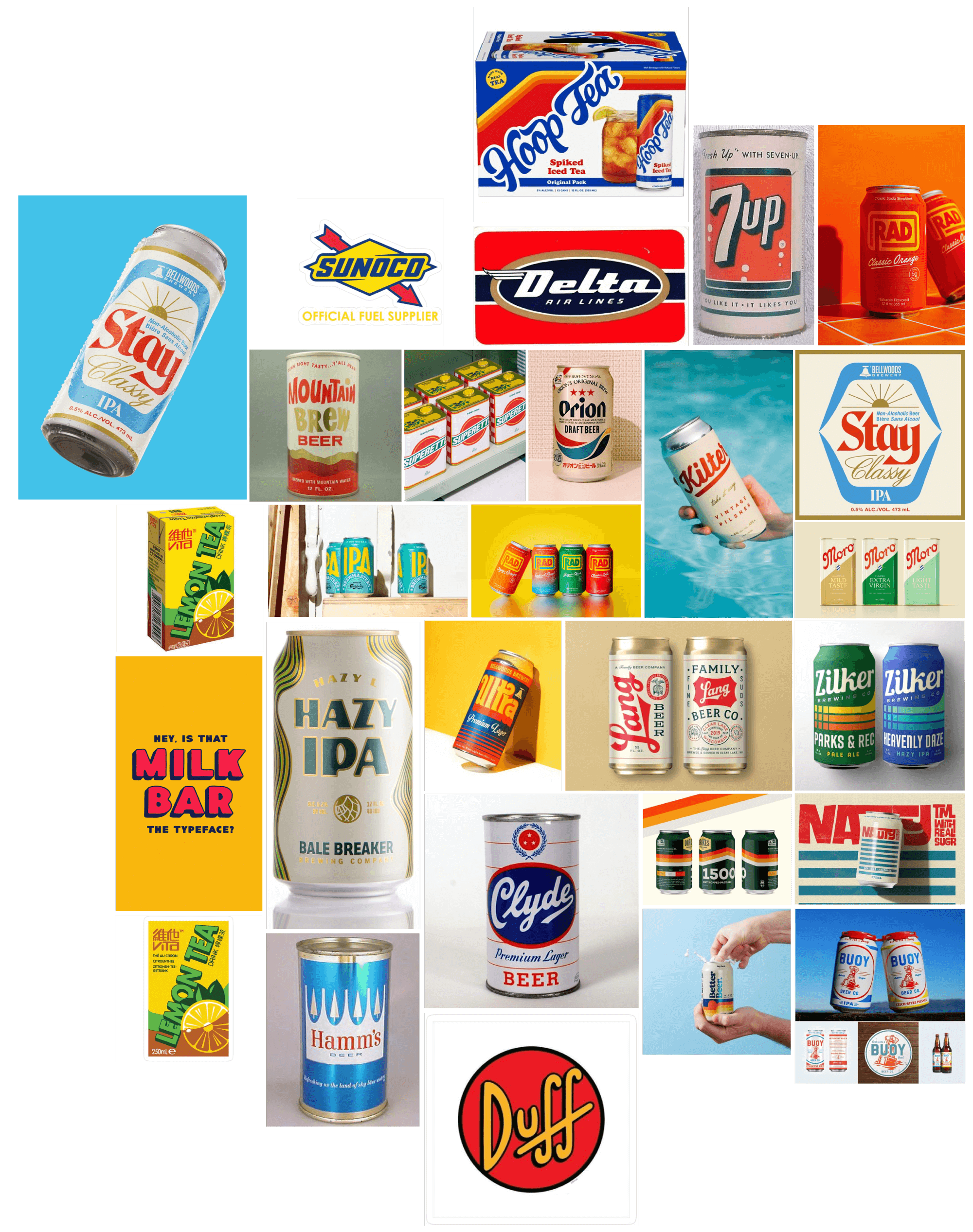
So instead of leaning into traditional cannabis aesthetics, we positioned MiD more like a vintage tea or soda brand— familiar, nostalgic, and easy to understand at first glance.
Strategic pillars:
Sessionable Positioning
We emphasized low-dose flexibility— something you can have multiple of, without overwhelm.Alcohol-Alternative Language
The messaging avoids insider cannabis culture and instead speaks to social drinkers looking for balance.Recognizable Flavor Cues
The lemon tea flavor profile inspired a visual direction reminiscent of classic iced tea brands— familiar, nostalgic, and shelf-legible.Scalable System
Every design decision supports future SKU expansion planned for 2026.
Visual Identity
MiD’s identity is bold yet nostalgic— designed to feel lively without feeling chaotic.
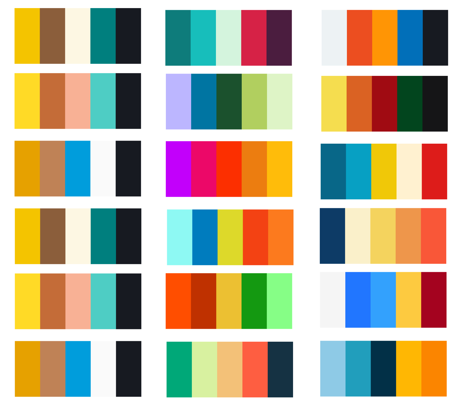
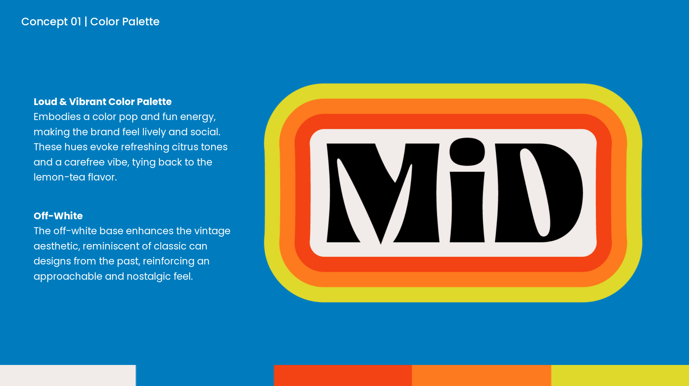
Loud & Vibrant Color Palette
Bright citrus-inspired hues embody social energy and refreshing flavor while delivering undeniable shelf presence.
Off-White Base
A soft off-white foundation reinforces the vintage soda aesthetic, adding warmth and approachability while giving the logo space to breathe.
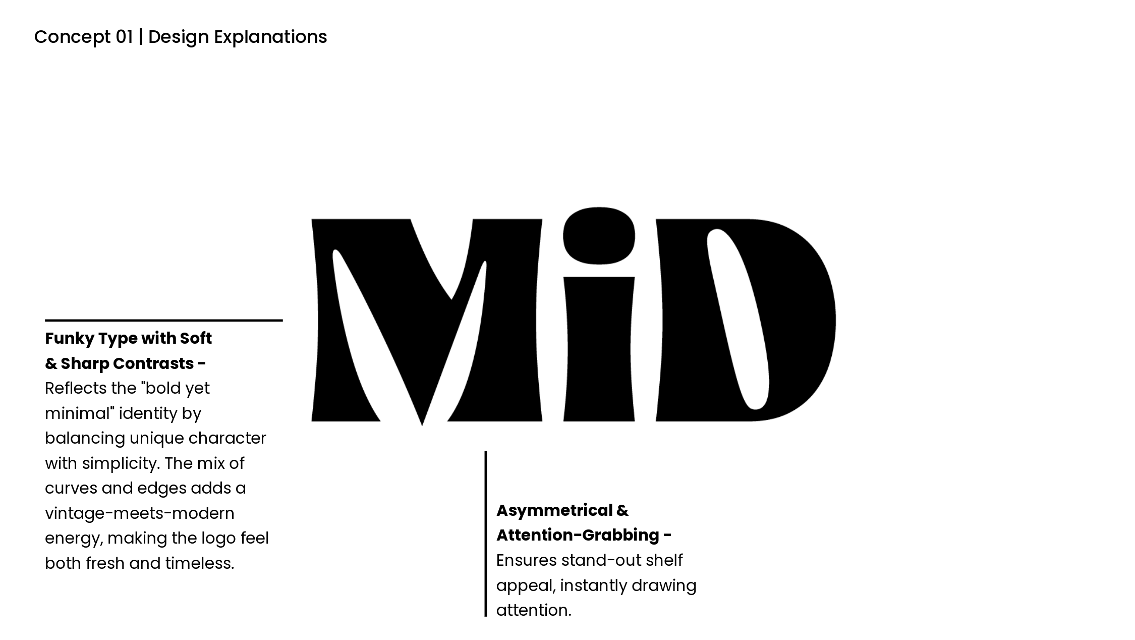
Funky Type with Soft & Sharp Contrasts
The wordmark balances curves and edges, blending playful personality with structural confidence. It feels bold, but not aggressive.
Flexible Logo System (Wordmark + Badge)
The logo suite allows for adaptability across cans, cases, merchandise, and marketing materials. Strong on white. Strong on color. Strong in small applications.
The identity says:
“Drink me.”
Without screaming cannabis.

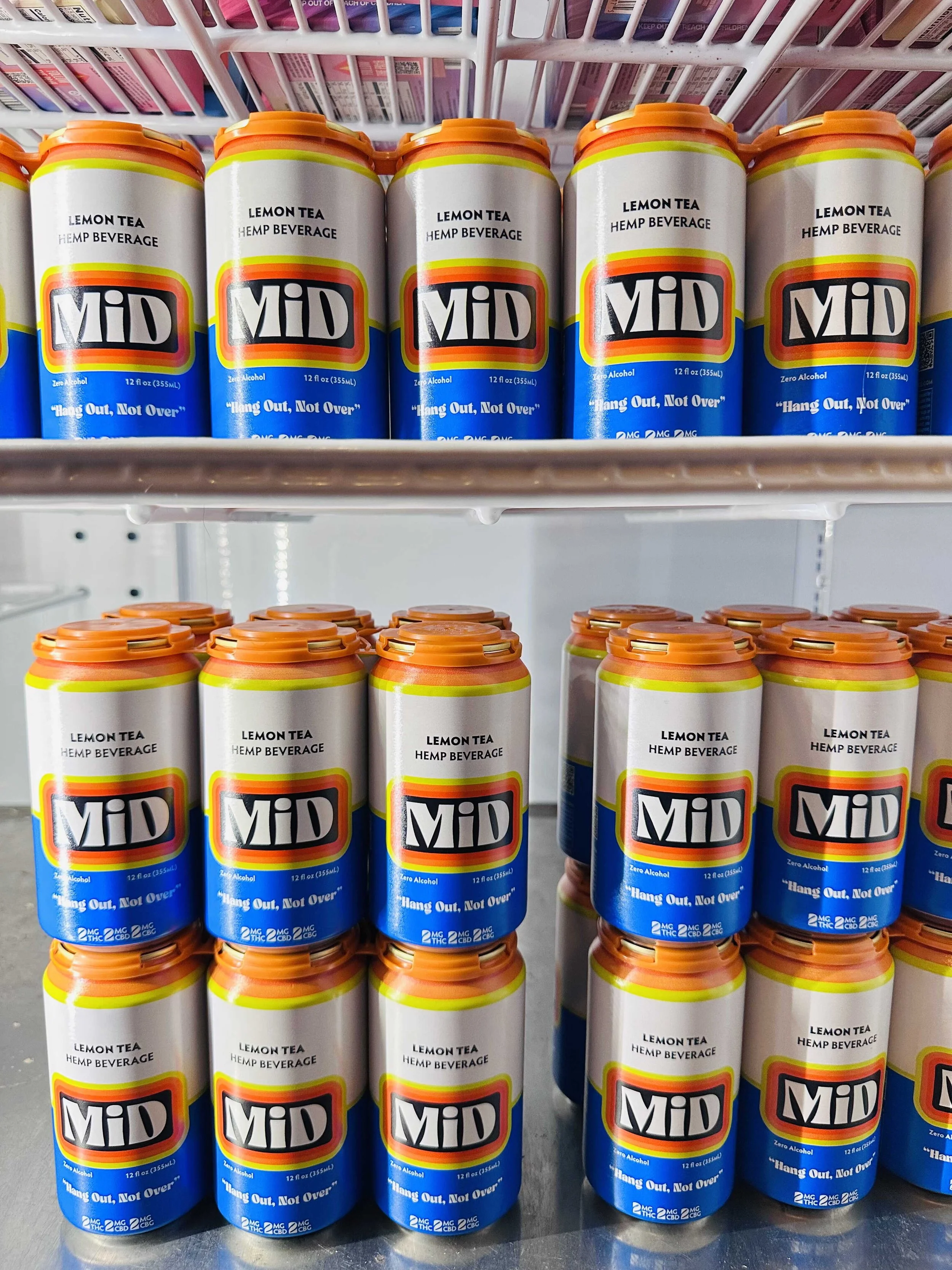
Packaging System
This is where the strategy becomes tangible.
The 12oz can design was built for:
Retail cooler visibility
On-premise bar presence
Immediate flavor recognition
Regulatory clarity
Stripe Elements
Playful striping nods to vintage soda and tea packaging— reinforcing nostalgia and refreshment.
Clean Information Hierarchy
Low dosage (2MG CBD, THC, CBG) is clearly communicated without overwhelming the design.
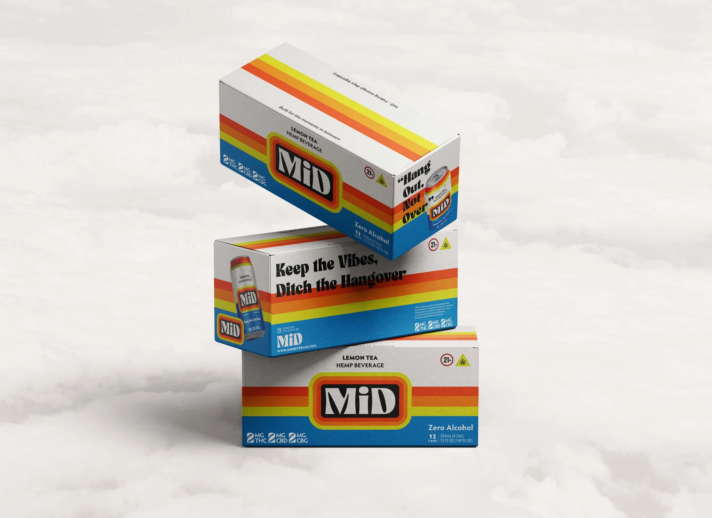
12-Pack Case Design
The outer case extends the brand system with strong logo presence and color blocking— built for stacking, distribution, and secondary shelf placement.
Retail Impact
MiD launched into:
7 retail locations
7 on-premise locations
14 local placements total
Statewide distributor partnership in progress
The design was built to support expansion— encouraging repeat purchase and multi-can sessions.
With SKU expansion planned for 2026, the brand system is already structured to extend into new flavors and formats without redesigning from scratch.
Outcomes
MiD entered the market with:
A cohesive brand identity
A shelf-ready packaging system
Clear positioning in a crowded category
Strong early retail adoption
The visual system now supports:
Distribution growth
On-premise expansion
Future product extensions
Most importantly, it created immediate recognition and strong positive feedback from both retailers and consumers.
What This Project Means to Me
MiD represents what I love most about beverage packaging:
You’re not just designing a can.
You’re designing behavior.
This project proves that thoughtful positioning & strong packaging systems can open new lanes inside competitive cannabis and craft beverage markets.
MiD isn’t just another THC drink.
It’s a new way to hang out.