Biscochito Cream
Brand & Packaging Design
Overview
Biscochito Cream is a seasonal cream liqueur from Safe House Distilling Co. inspired by the delicious Biscochito— a traditional anise-spiced cookie deeply rooted in New Mexico culture.
The product was created as a holiday seasonal release designed to capture the warm, nostalgic flavors of biscochito cookies in liquid form. Sold throughout New Mexico for a limited two-month window each year, the product appears in liquor retailers and seasonal events such as the River of Lights.
I partnered with the distillery to design packaging that honored New Mexico heritage while standing out on crowded retail shelves.
The result is a bold, heritage-inspired bottle design printed on a fully recyclable cardboard bottle— combining storytelling, sustainability, and shelf impact.
The Challenge
Safe House Distilling was launching a seasonal spirit inspired by New Mexico’s most iconic cookie— a product with strong cultural meaning and emotional nostalgia for locals.
The packaging needed to accomplish several goals at once:
• Celebrate the heritage and tradition behind biscochito cookies
• Stand out during the busy holiday retail season
• Appeal to both New Mexico locals and visiting tourists
• Visually communicate warmth, indulgence, and craft quality
Because the product is sold for only two months each year, shelf impact was especially important. The bottle needed to immediately capture attention while communicating a sense of authenticity tied to New Mexico culture.
MY ROLE
Brand & Packaging Design
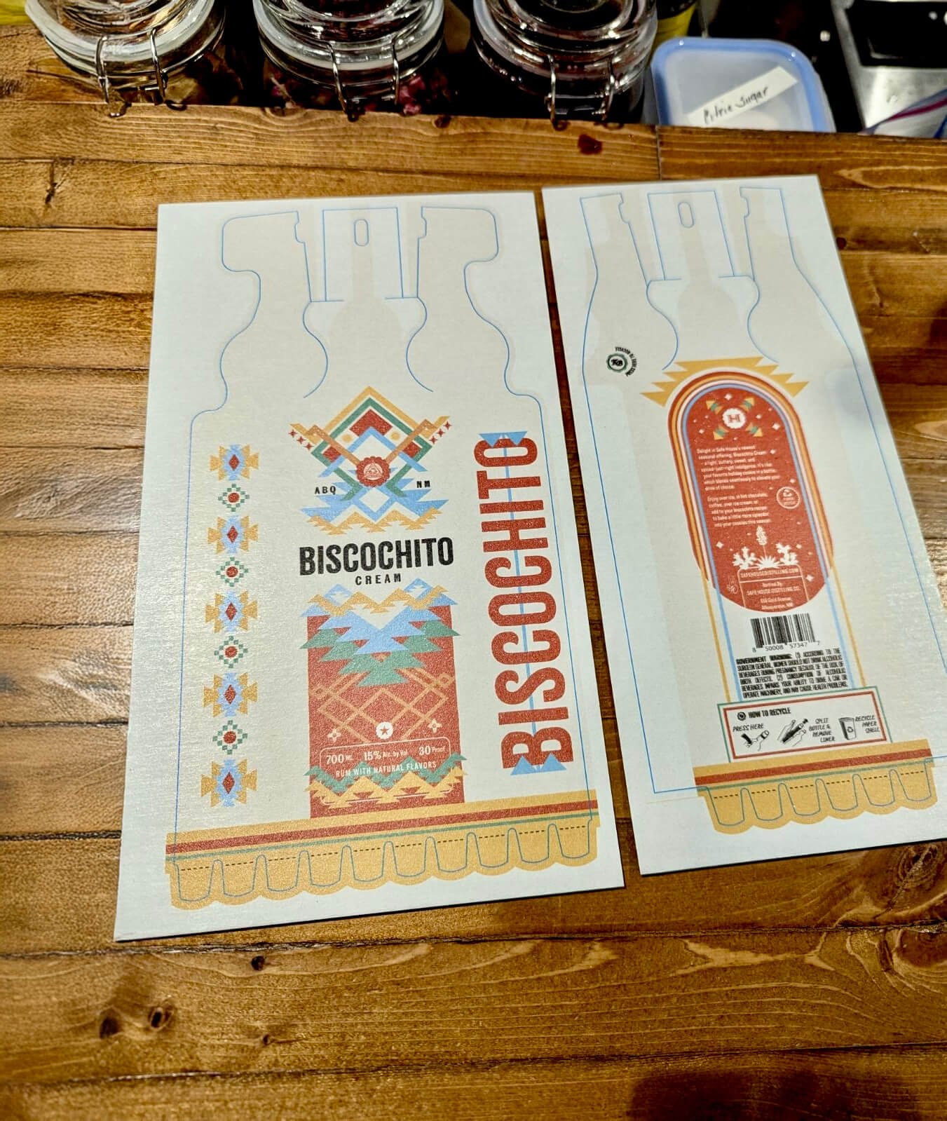
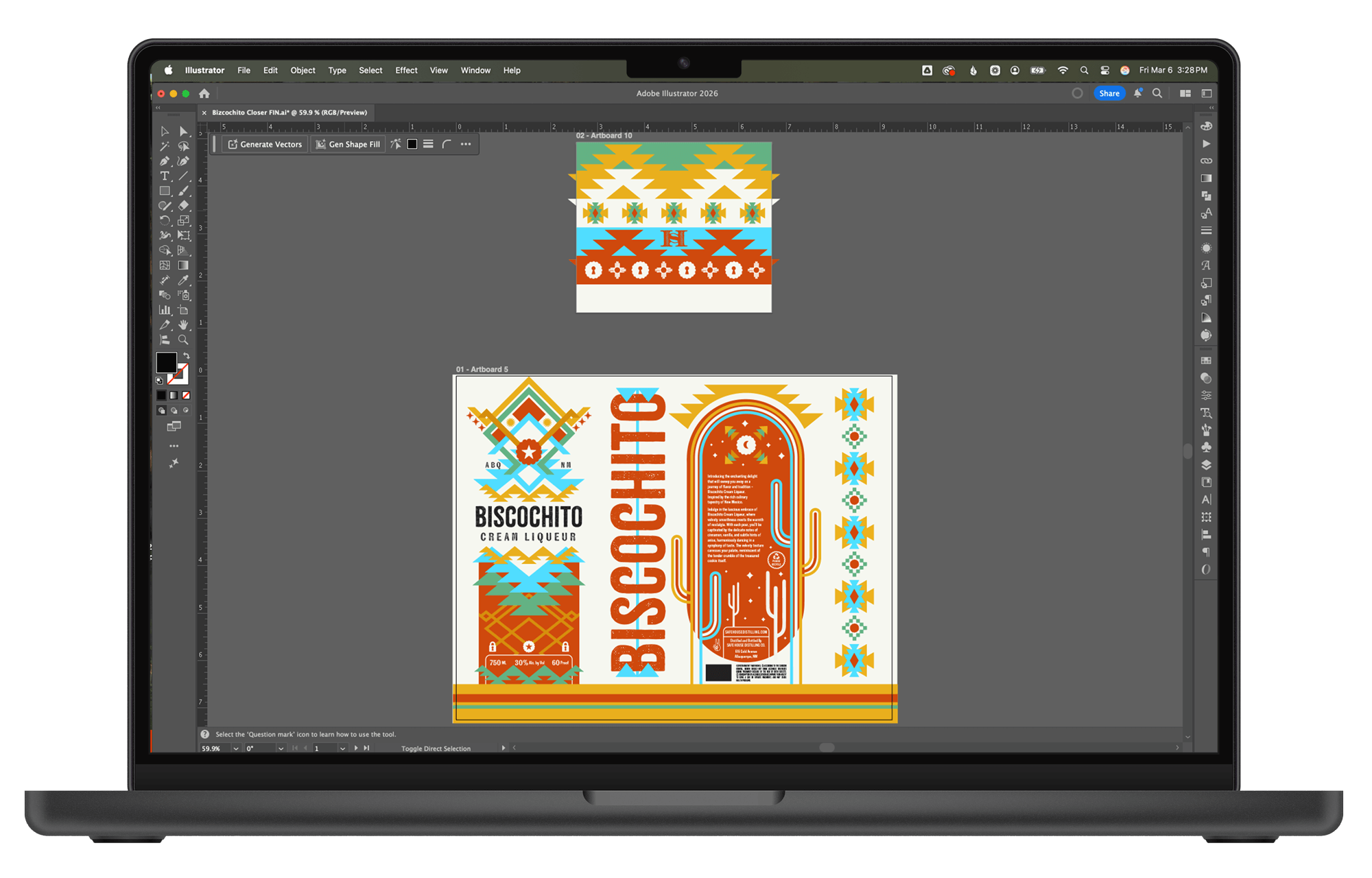
I led the visual design for the packaging system, creating the full graphic treatment that wraps around the bottle structure.
Deliverables included:
• Full bottle graphics
• Custom typography treatment
• Color system and illustration elements
• Production-ready files for manufacturing
The goal was to build a visual identity that felt both cultural and bold, while integrating seamlessly with the unique bottle structure.
STRATEGY
The packaging strategy focused on three key pillars:
Cultural Authenticity
Because biscochito cookies are deeply tied to New Mexico tradition, the design needed to feel rooted in regional culture rather than generic holiday aesthetics.
Visual references to Southwestern design, desert landscapes, and traditional decorative motifs helped anchor the product in place and heritage.
Shelf Distinction
Holiday liquor shelves are extremely competitive. The packaging needed bold visual energy that could attract attention from a distance while still feeling refined and premium.
Sustainable Innovation
The product uses an alternative bottle format designed to reduce material impact and improve recyclability. The visual system needed to complement this innovation while maintaining the feel of a craft spirit.

Visual Identity
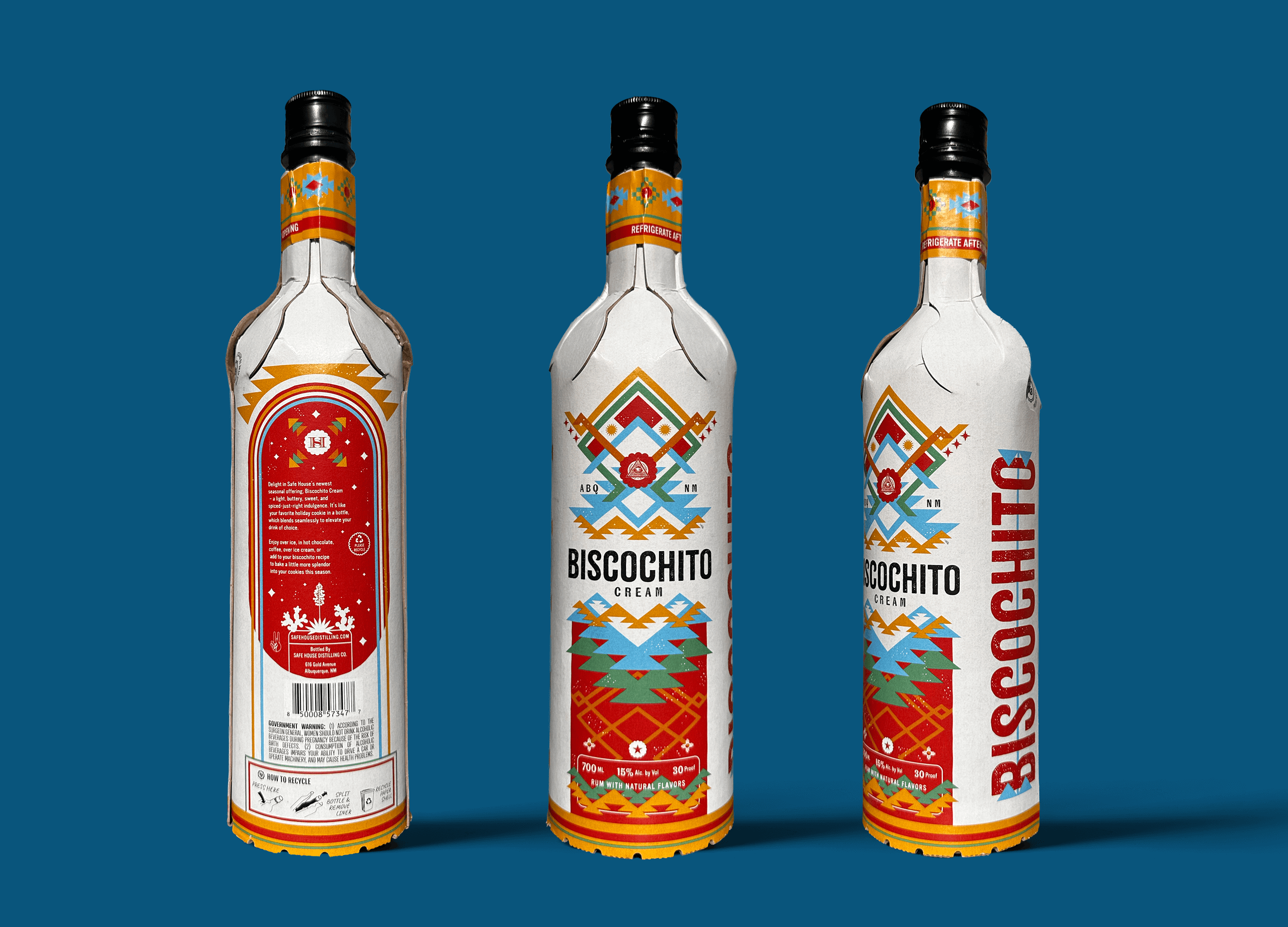
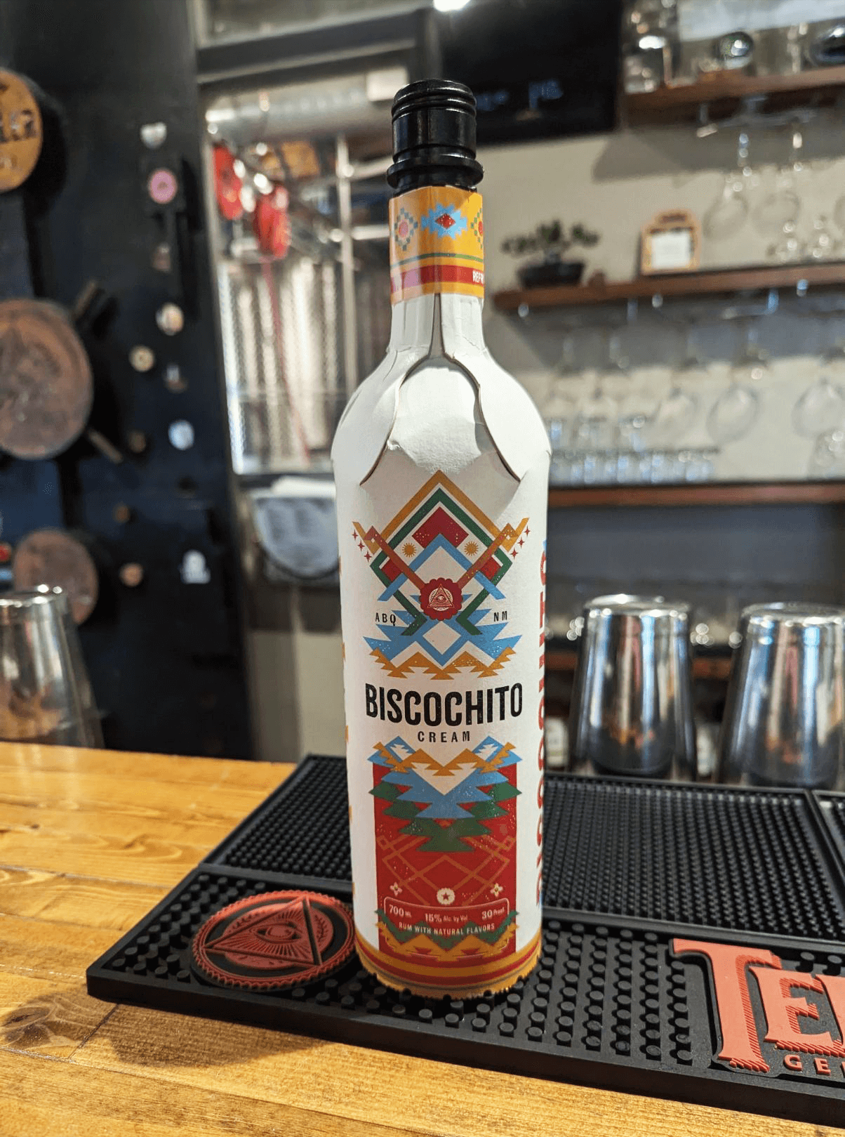
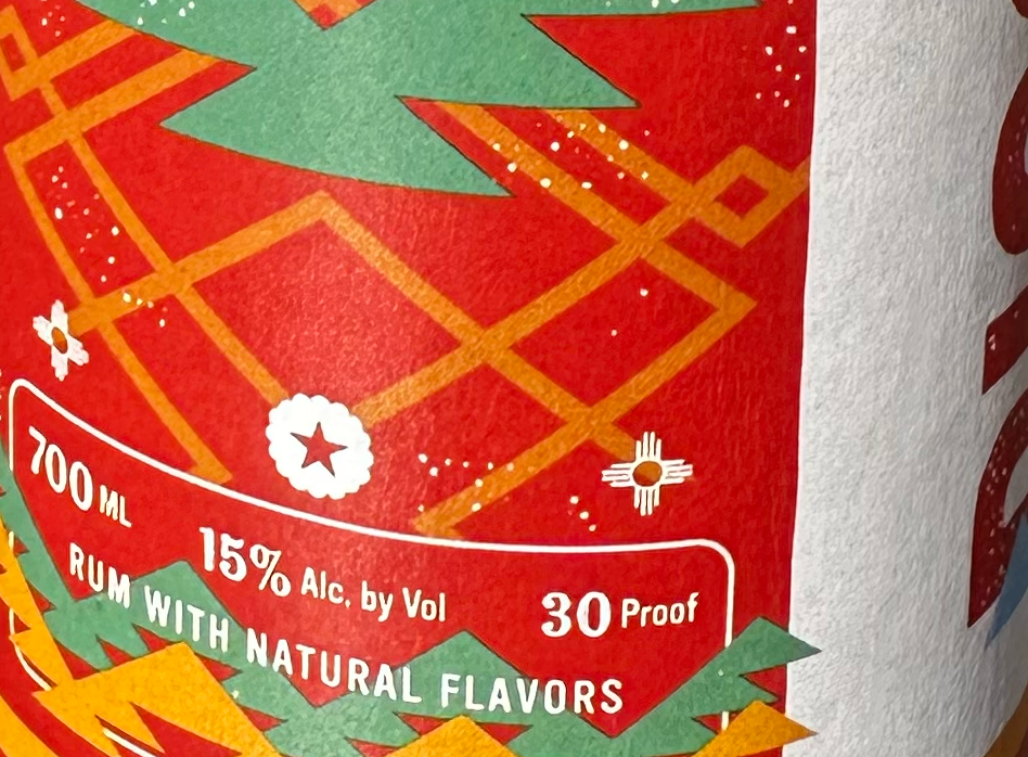
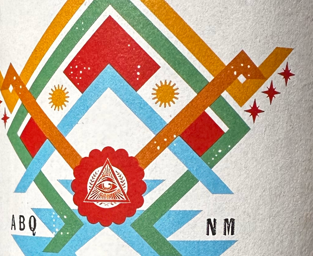
The packaging design blends Southwestern heritage with bold shelf presence.
Desert-Inspired Color Palette
The bottle features a rich desert color palette set against an off-white base. Deep, striking colors evoke the natural tones of the New Mexico landscape while ensuring strong shelf visibility.
The off-white foundation also reinforces a slightly vintage aesthetic, reminiscent of traditional food packaging and handcrafted goods.
Heritage-Inspired Visual Elements
Southwestern patterns and botanical foliage reference regional design traditions while adding visual texture to the packaging. These details help connect the product to the cultural roots of biscochito cookies.
Character-Driven Typography
The typography combines weathered, expressive typefaces that feel handcrafted and full of personality. The result is a typographic system that balances authenticity with visual impact.
Together, these elements create a design that feels nostalgic, celebratory, and distinctly tied to New Mexico.
Packaging System
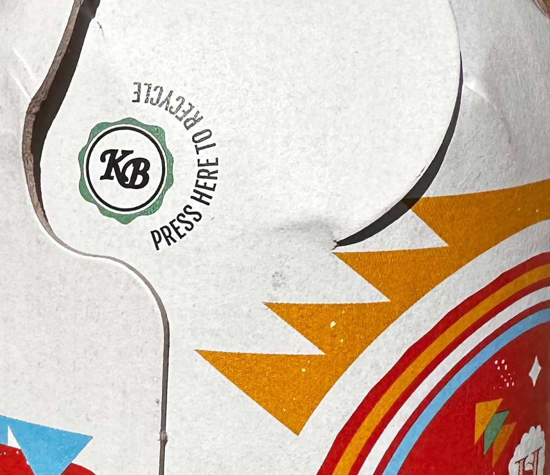
Unlike traditional glass bottles with small labels, the design utilizes the entire bottle surface as a canvas, allowing the graphics to fully surround the product and maximize shelf presence.
This approach helped transform the bottle into a highly recognizable object within retail environments and seasonal displays.
Sustainable Packaging Innovation
Biscochito Cream is packaged using the KB Bottle, developed by Kinsbrae Packaging.
The bottle combines a paperboard outer shell with an internal pouch designed to hold non-carbonated liquids such as spirits, wine, and specialty beverages.
Key benefits include:
• Lightweight, shatterproof construction
• Reduced transport weight compared to glass
• Designed for easy recycling
• Paperboard outer shell recyclable through standard paper streams
The design wraps around the full bottle surface, allowing the packaging graphics to work cohesively with the sustainable structure while maintaining a premium shelf presence.
Retail Presence
The product is released seasonally for approximately two months each year and is sold throughout New Mexico in liquor retailers and seasonal events.
One of its most notable retail placements is the annual River of Lights, where the product is sold during the winter festival at the Albuquerque Zoo.
Because the product is available for a limited time, the packaging plays an important role in generating immediate shelf interest and encouraging impulse purchases.
Outcomes
Since launch, the packaging has received enthusiastic feedback from the distillery and retail audiences.
• The bottle design consistently stands out in seasonal retail displays
• The distillery has received strong positive feedback on the packaging
• Customers frequently comment on the unique bottle design
• The packaging helps reinforce the product’s cultural story and seasonal appeal
The result is a product that feels artistic, memorable, and rooted in New Mexico tradition.
What This Project Means to Me
Biscochito Cream represents a meaningful intersection of cultural storytelling, sustainability, and craft beverage design.
It was an opportunity to create packaging that celebrates regional identity while exploring new approaches to environmentally conscious packaging.
Projects like this reinforce my belief that great packaging design goes beyond aesthetics— it tells a story, connects with culture, and helps products stand out in increasingly competitive environment